

Case Study
Solvd
Challenge
Invoca’s brand had strong equity but lacked consistency. Multiple treatments and styles diluted recognition, resulting in an identity that felt cluttered and indistinct. A more mature, recognisable system was needed to strengthen positioning while allowing flexible expression without losing control.
Strategy
The approach focused on building a system that balances maturity with flexibility. Clear guidelines expanded signature elements into scalable components, enabling consistent expression across use cases. The framework was designed to support internal adoption, giving teams the structure and tools to execute confidently across touchpoints.
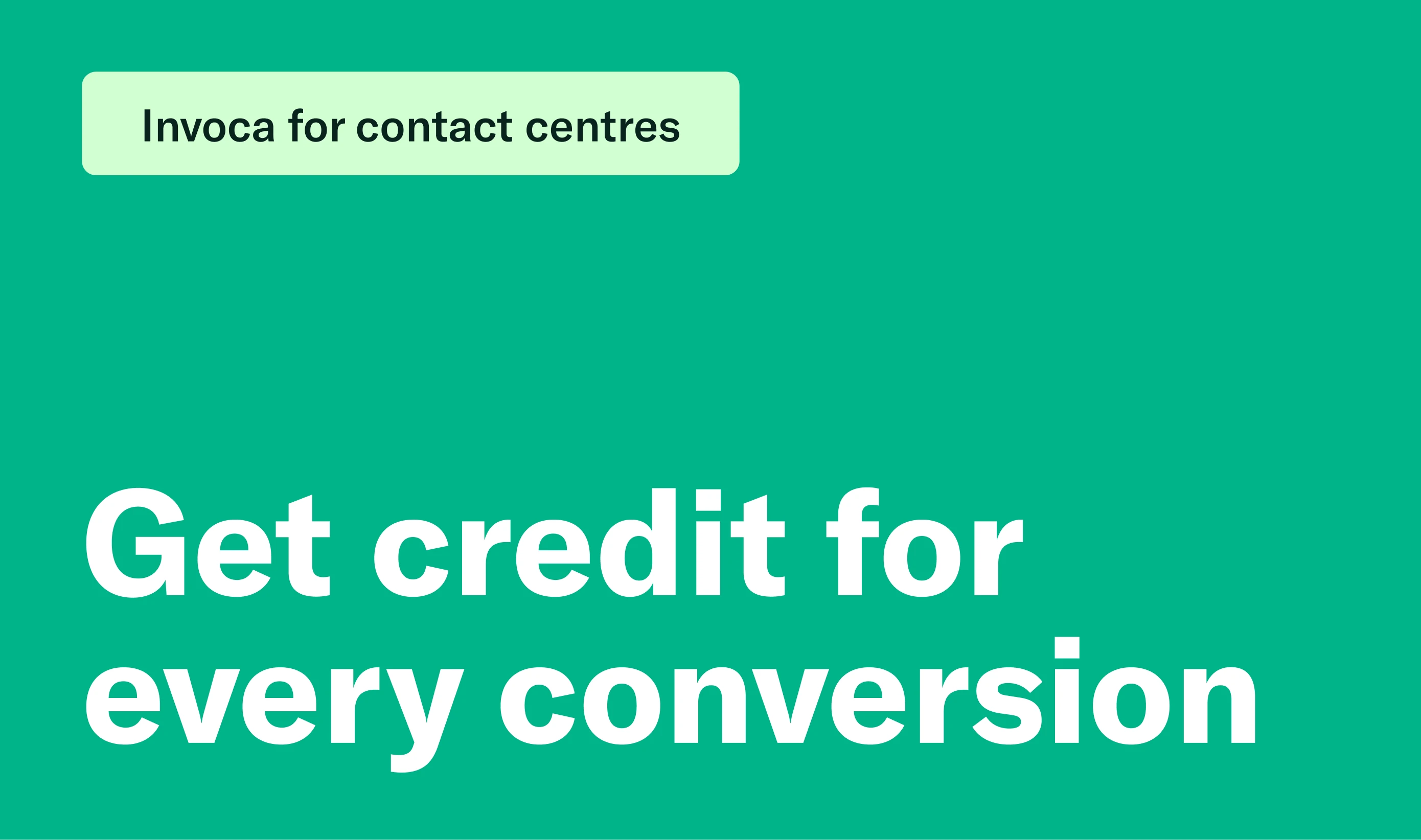
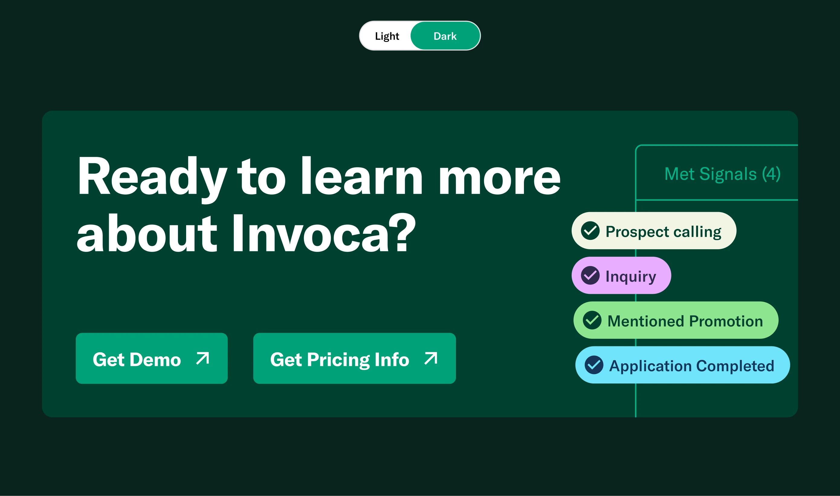
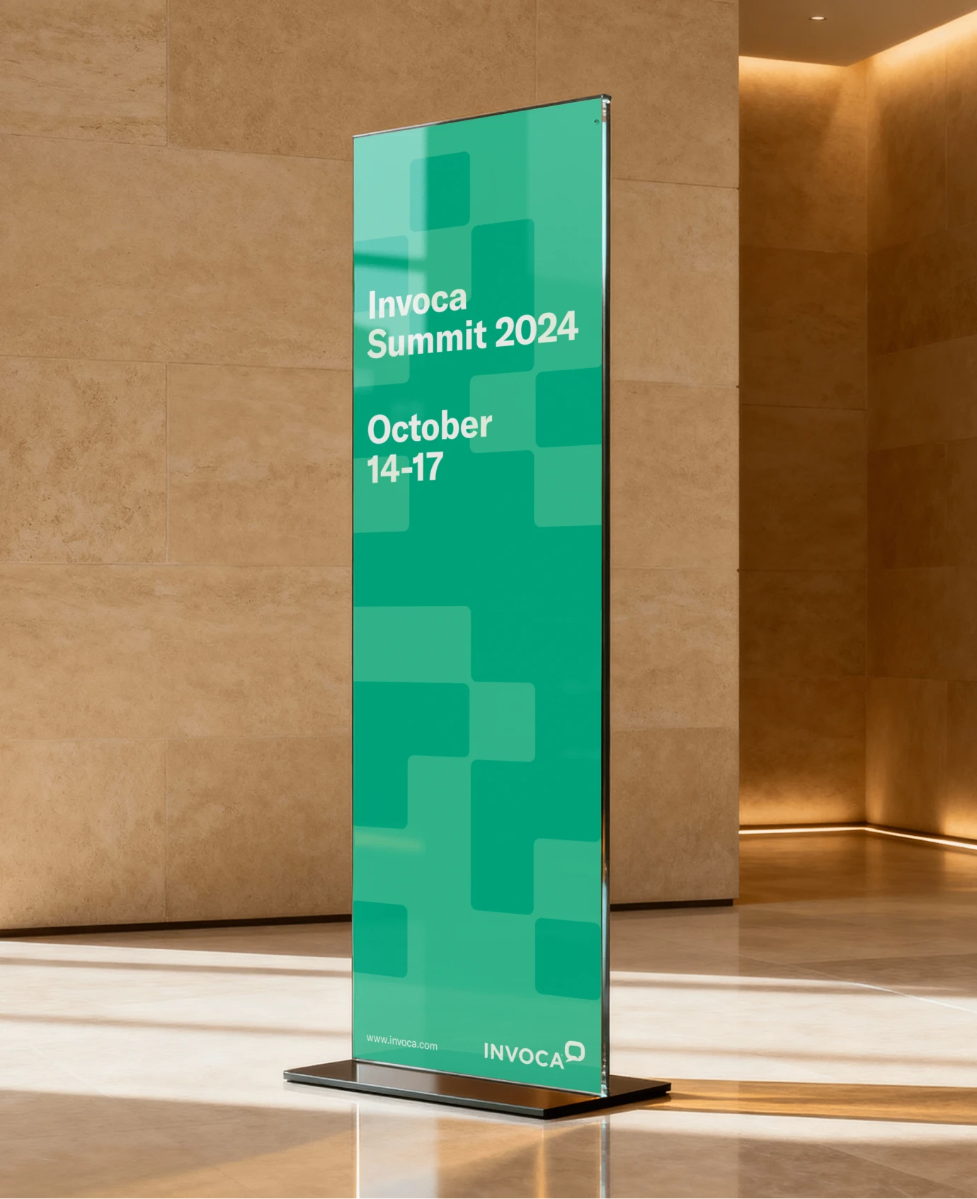
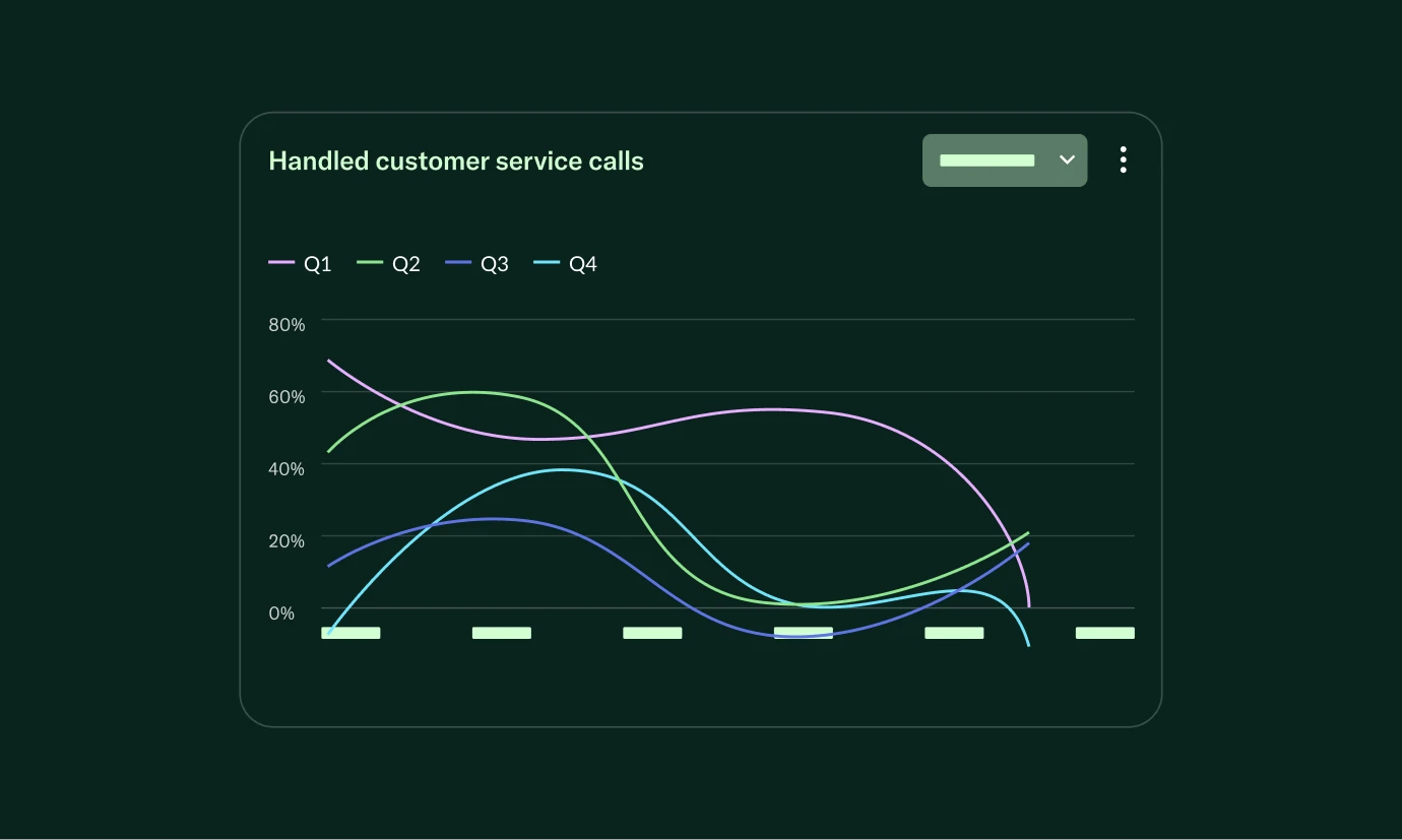
Brand
The identity was developed as a flexible system rooted in recognisable core elements. A mature green palette expands from the signature colour to support a wider range of expression, while a secondary accent palette reinforces iconography and UI elements. A structured grid pattern creates connected visual devices across layouts, image crops, and iconography. GT America strengthens clarity and tone across communications, supported by presentation, social, and marketing templates that ensure consistency in day-to-day use.


Our collaboration with Invoca influenced the following results
1+
Years of ongoing partership
What our client said
The work and partnership were appreciated and I look forward to us jumping into it again in a few short months for Enterprise Connect!