Case Study
Solvd
Challenge
Creatd’s visual identity and communication strategy had fallen out of step. A misalignment across communication pillars — spanning tech, agency, e-commerce incubation, and transmedia production — meant the brand wasn’t telling a coherent story to shareholders or its creator audience.
Strategy
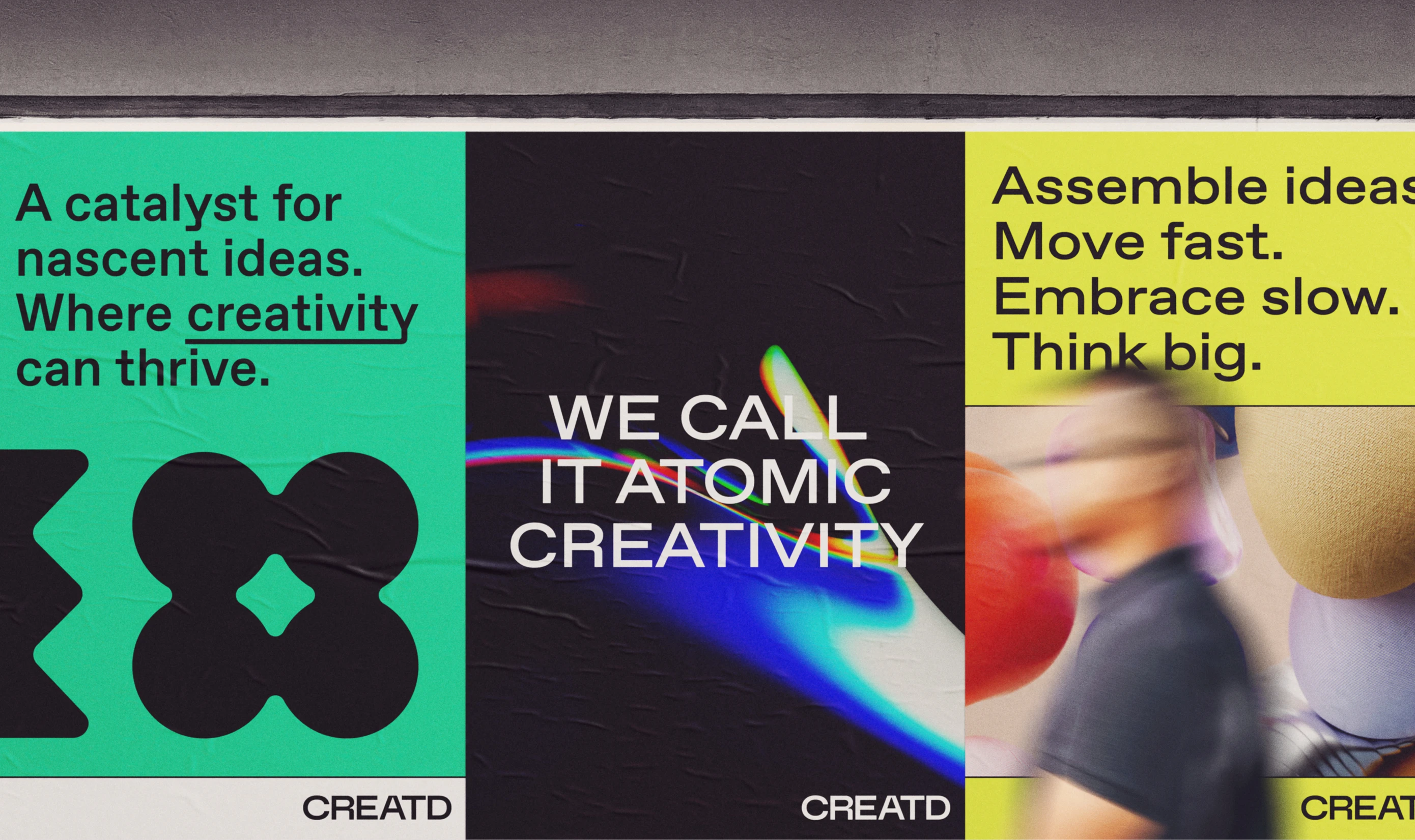
We redefined the communication strategy and aligned stakeholders before any design work began. New communication pillars established a clear foundation for the brand system, ensuring every subsequent decision followed the same strategic direction.
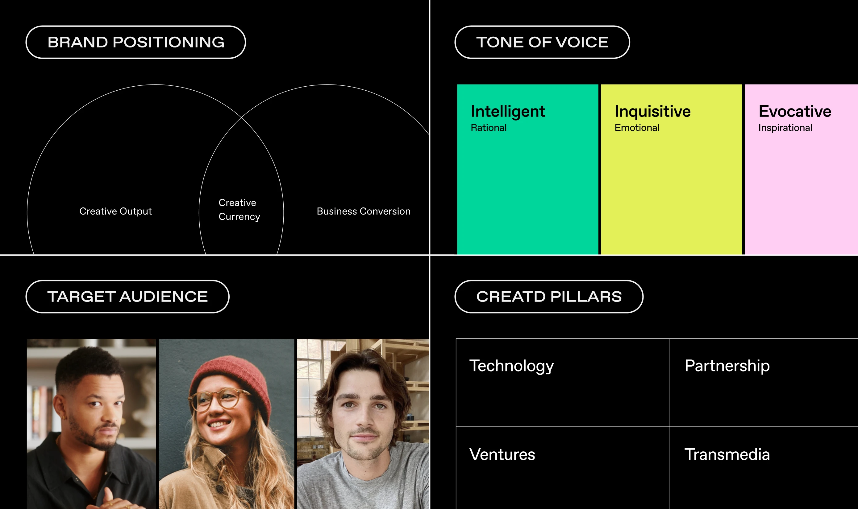
Brand
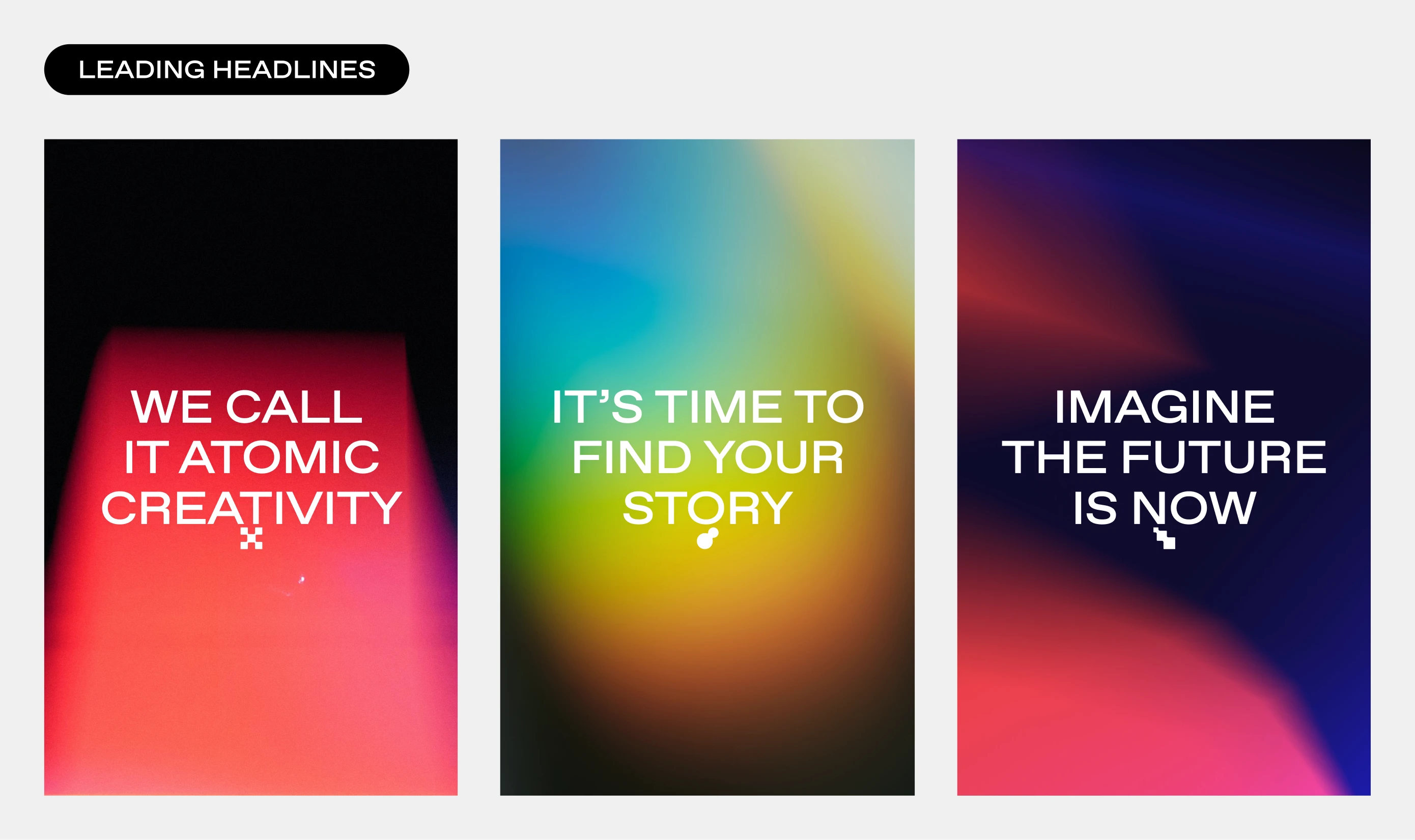
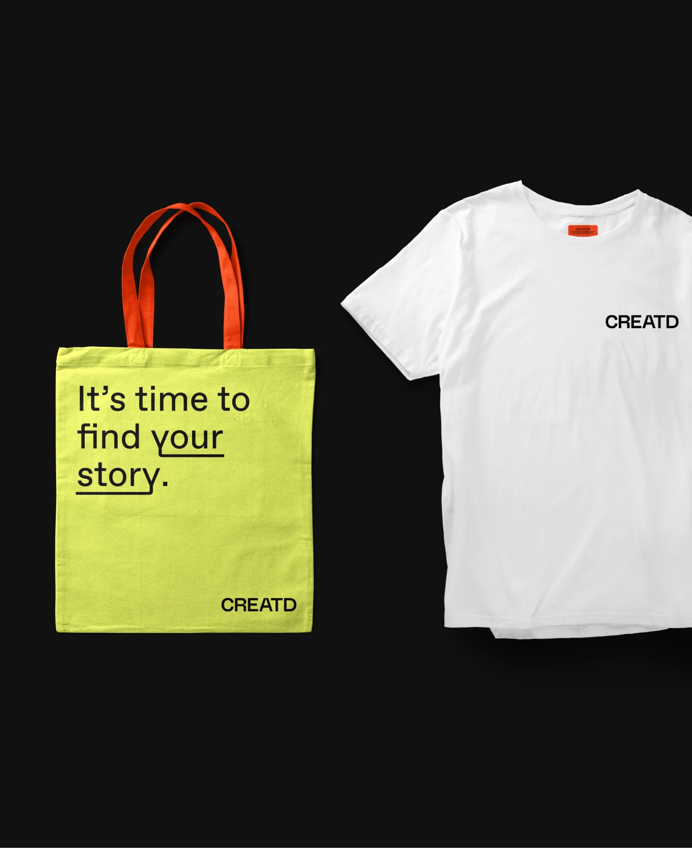
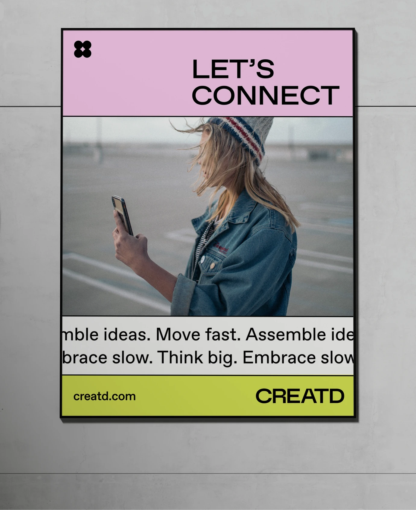
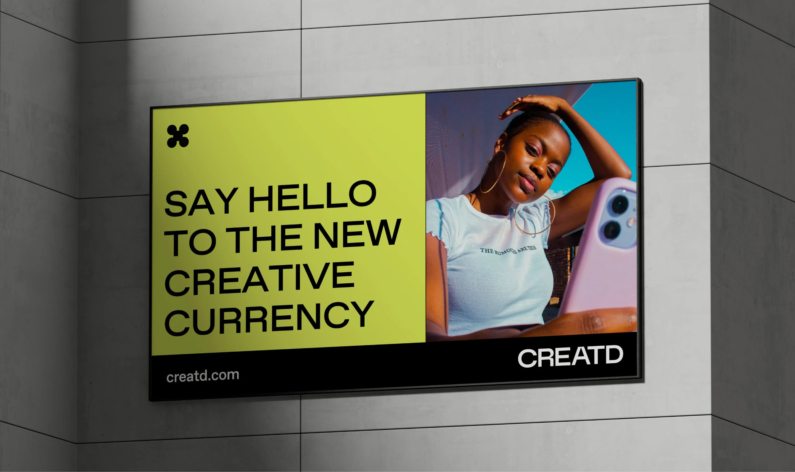
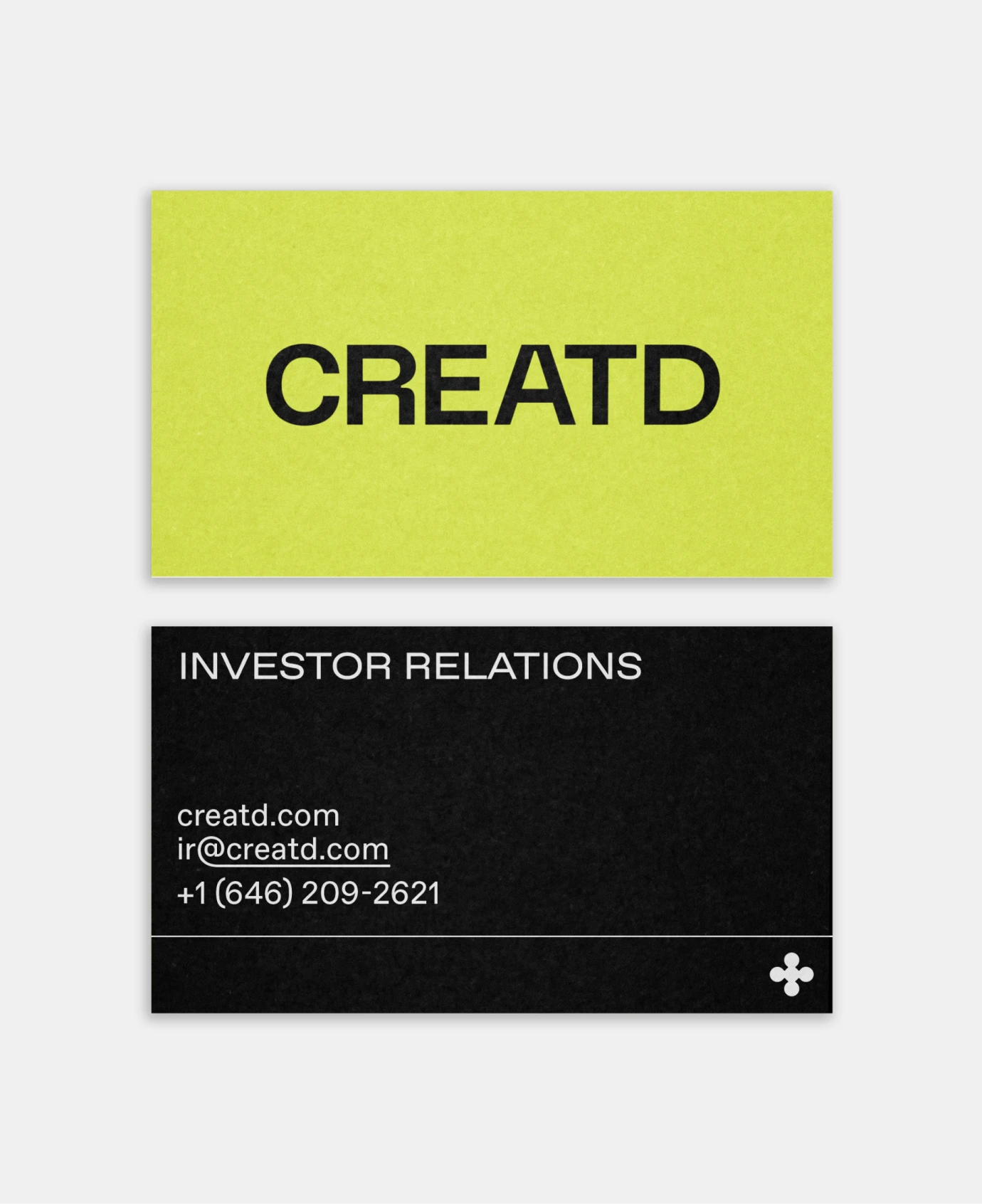
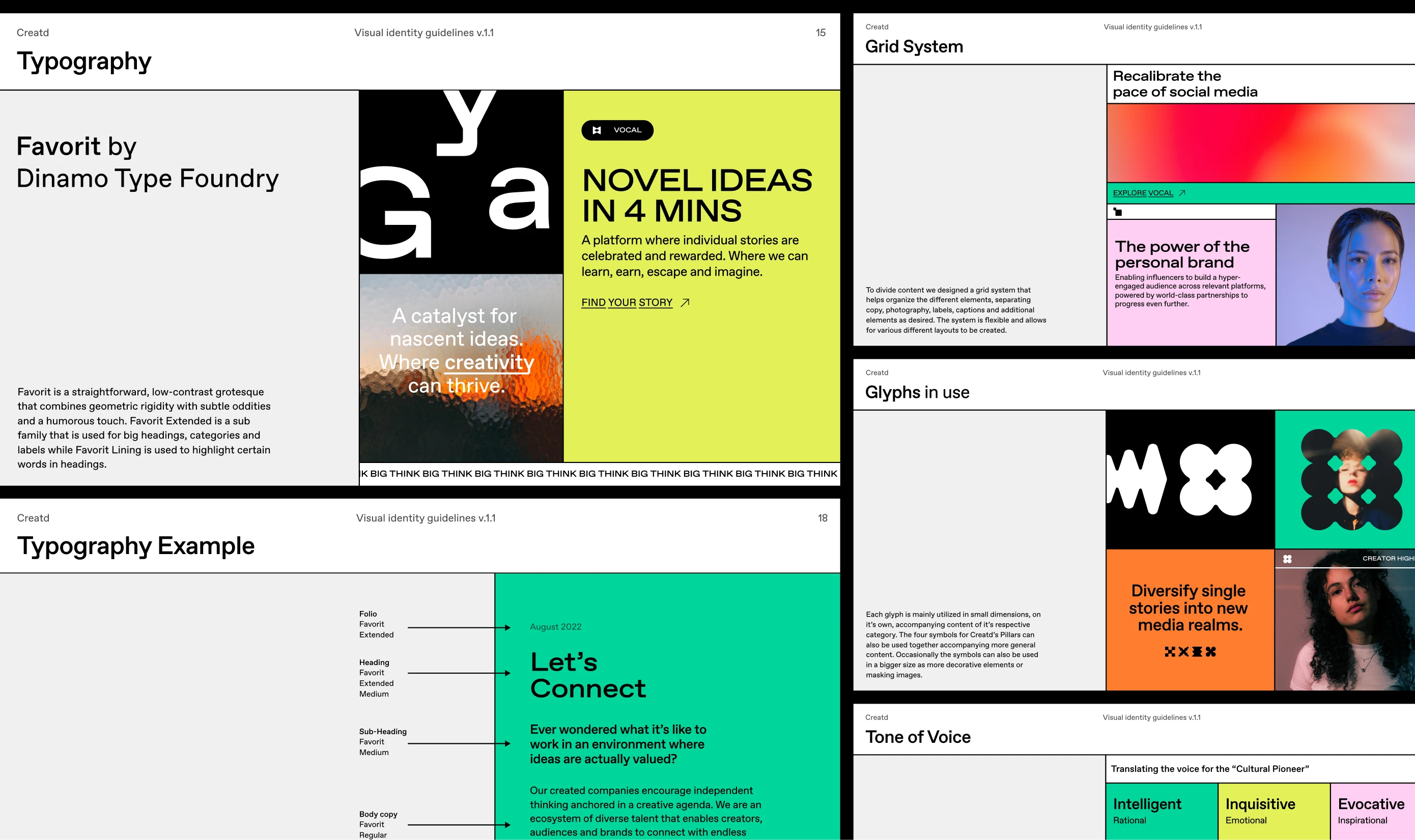
A custom wordmark was developed to balance standalone strength with flexibility across sub-brands. A new colour system, typography, and pattern language created consistency and adaptability, designed to support growth rather than constrain it.
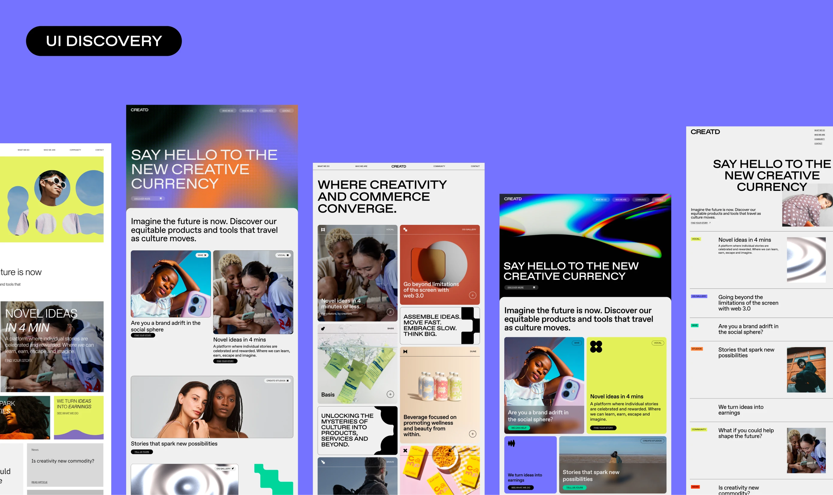
Website
We restructured navigation and information architecture before applying the new design language across the experience. Expressive photography, colour, and extended typographic hierarchy bring the communication strategy into the interface. The system was implemented in Webflow, alongside a redesigned investor portal aligned with the refreshed brand and strategic direction.