

Case Study
Solvd
Challenge
Vmax had outgrown its identity. Built around athletes and fitness studios in Germany and parts of the US, the brand no longer reflected the platform it had become or the global markets it was ready to enter. A new name, visual identity, and product UI were needed, alongside legal protection across multiple markets.
Strategy
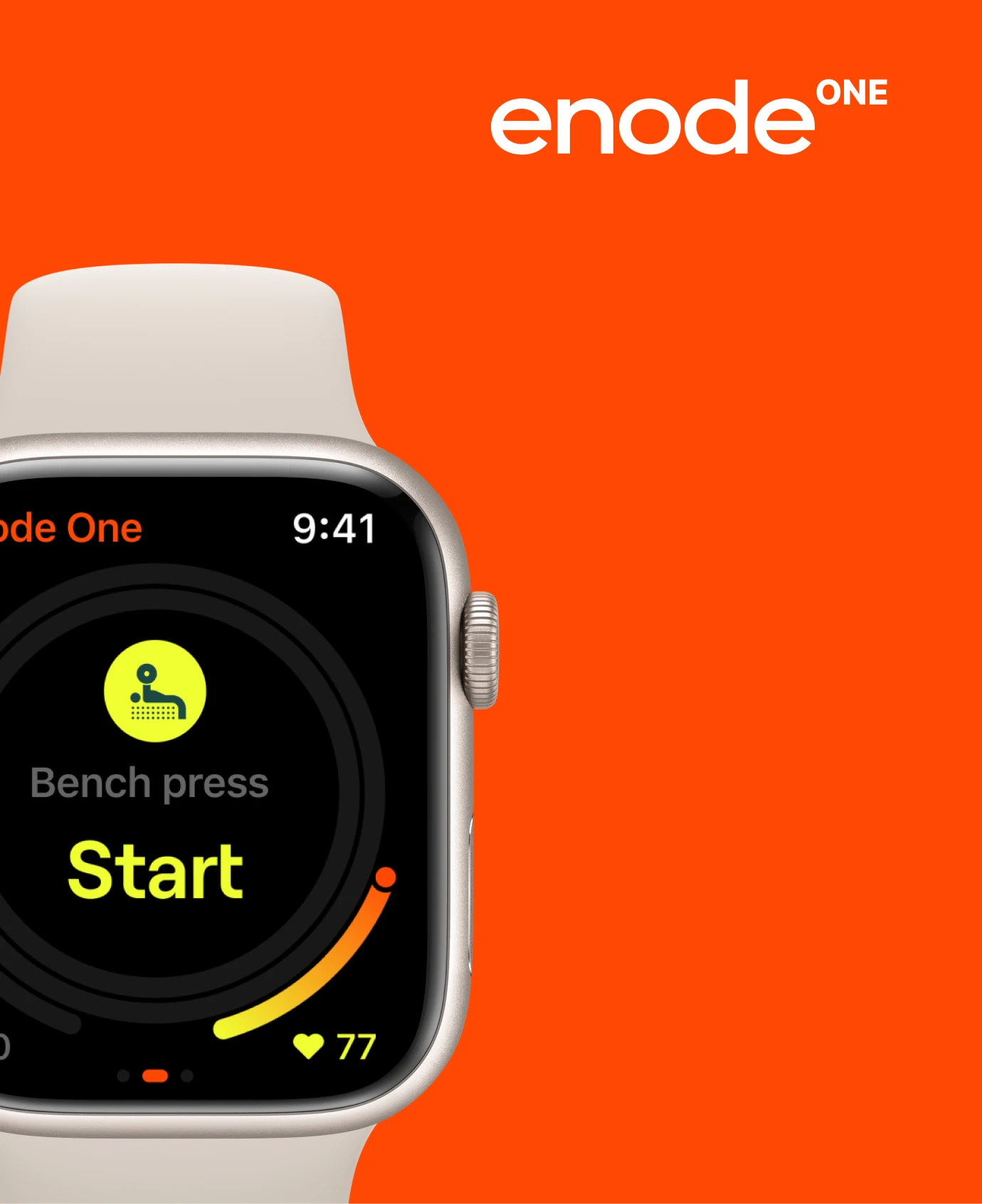
In a category full of powerful, maximal names, we leaned toward accuracy, measurement, and movement analysis. The name Enode, drawn from the Latin ‘enodo’, meaning to untangle and elucidate, was chosen to define the brand’s core purpose: revealing the complexities of the human body through data. Sub-products were named to reflect user context — Enode One for individual trainers, Enode Pro for coaches and elite athletes.
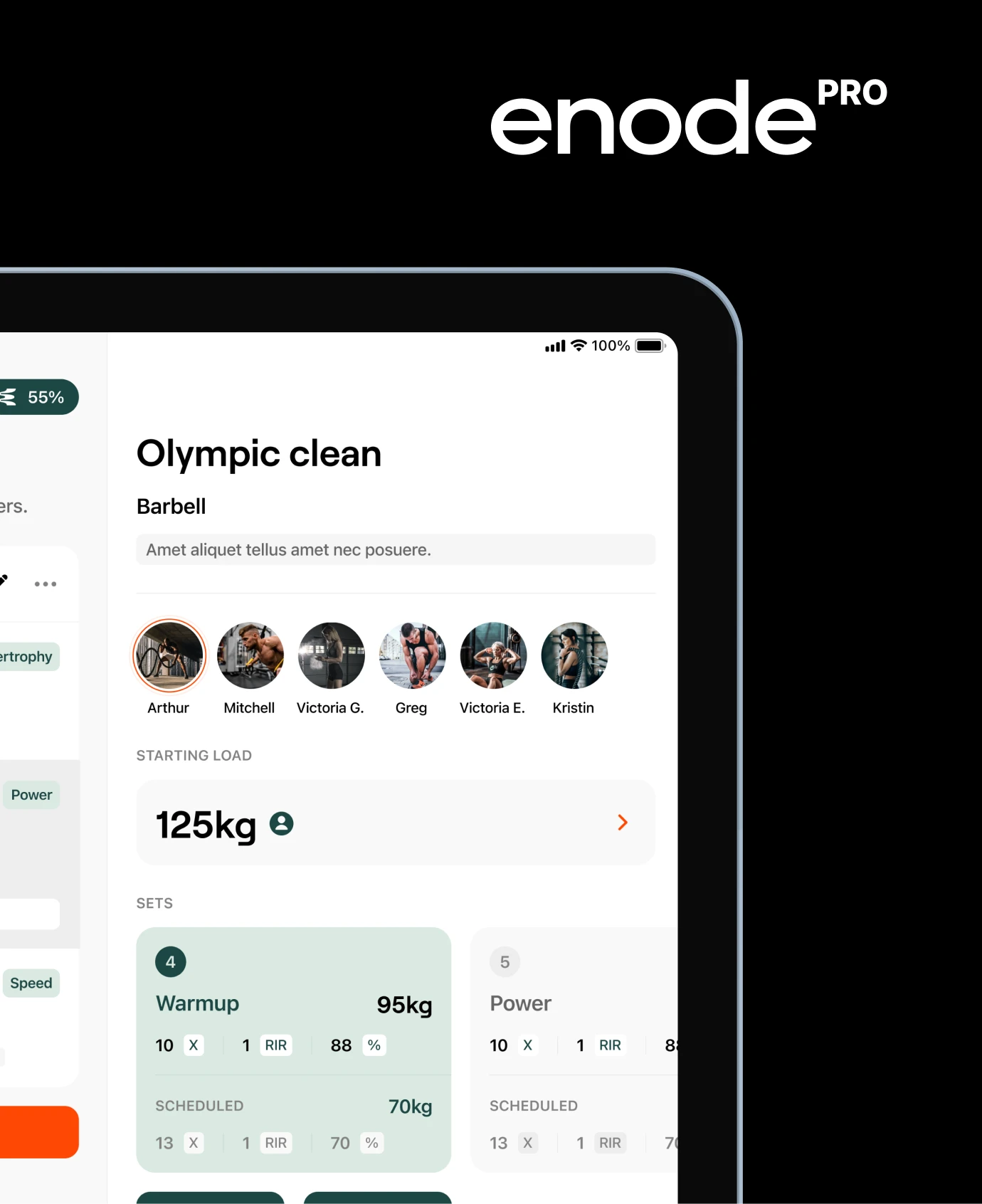
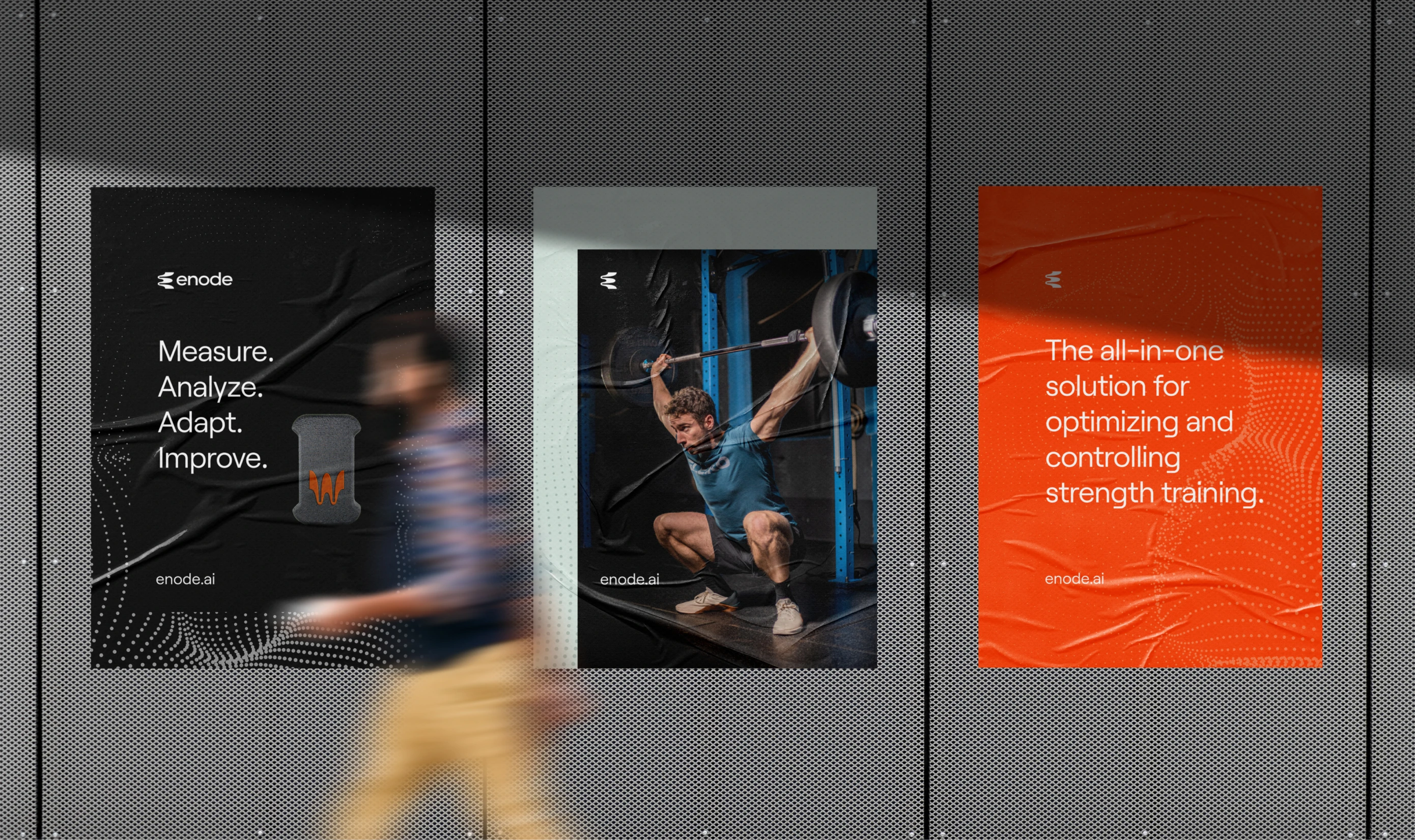
Brand
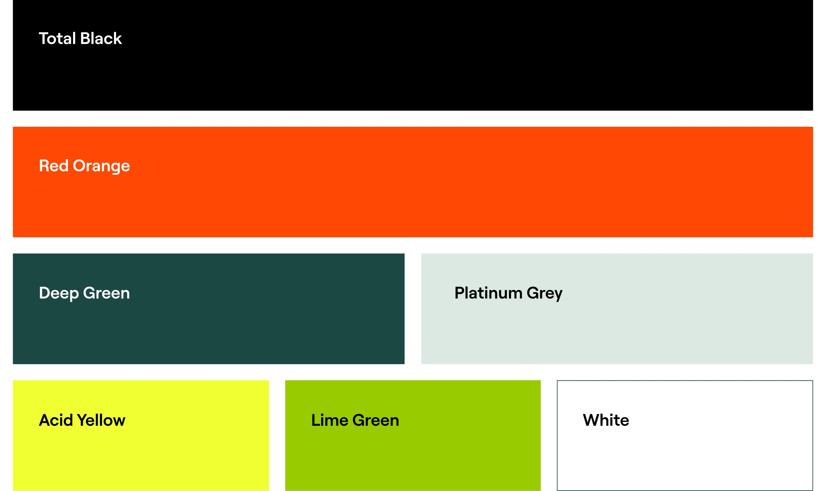
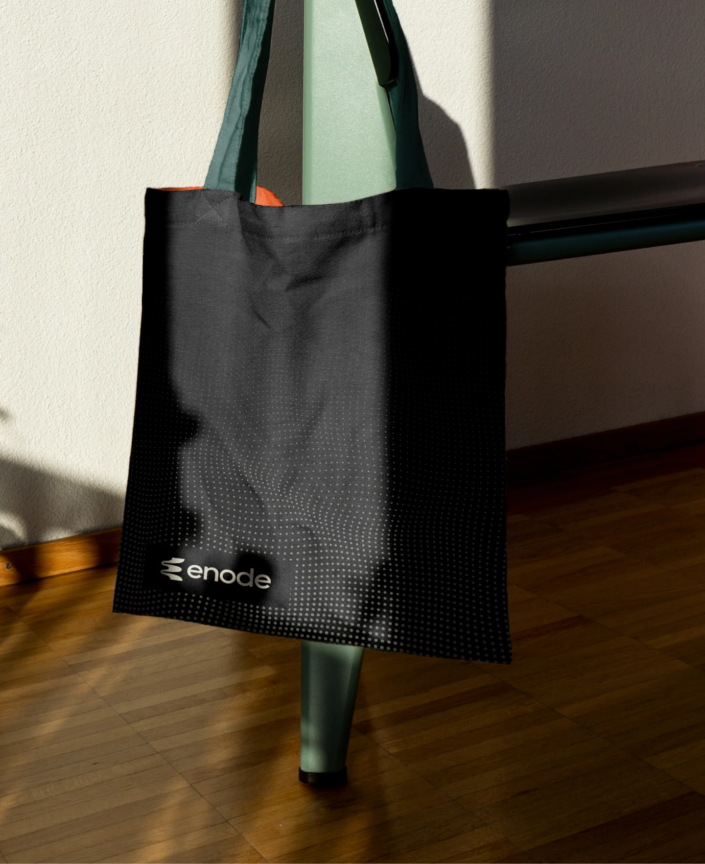
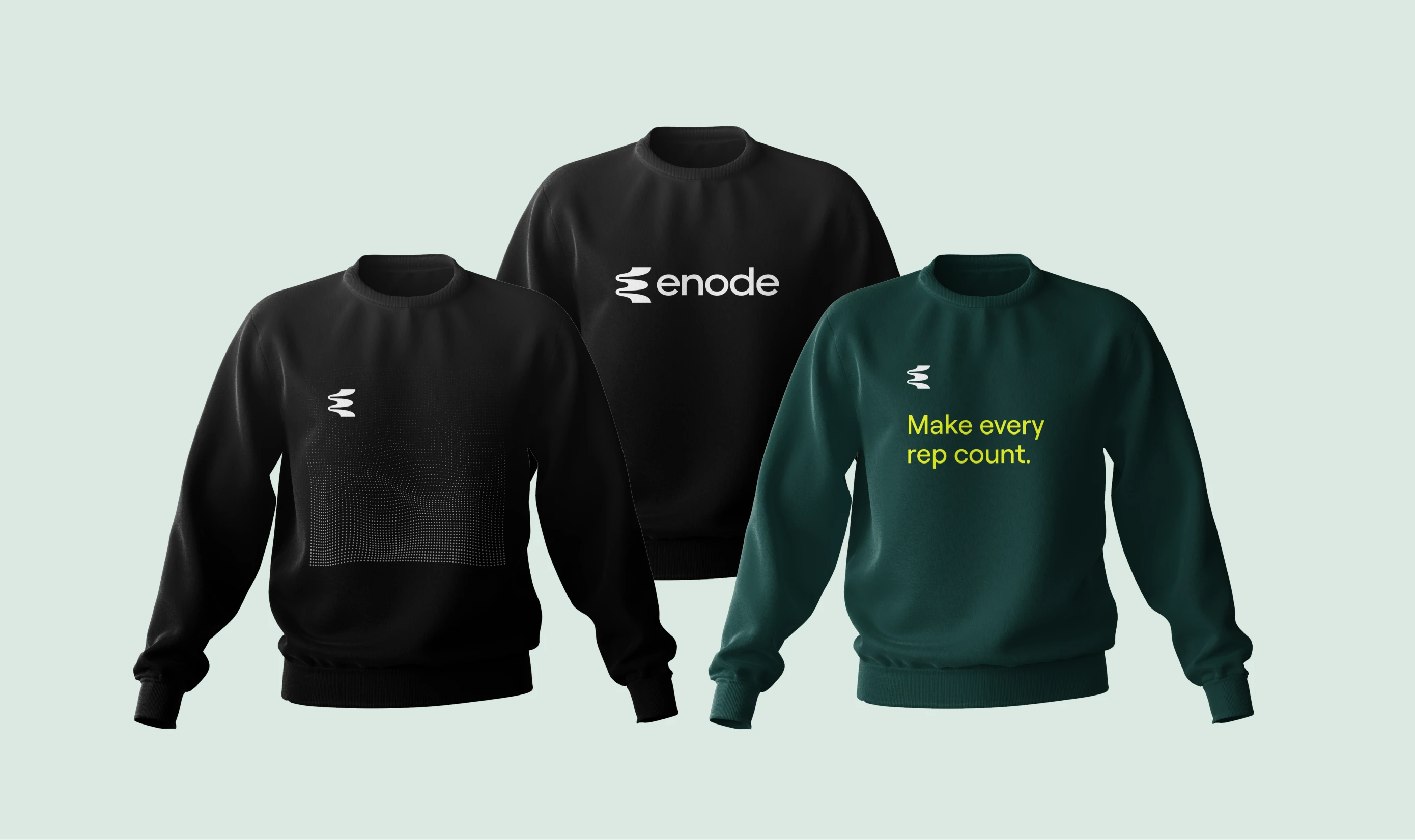
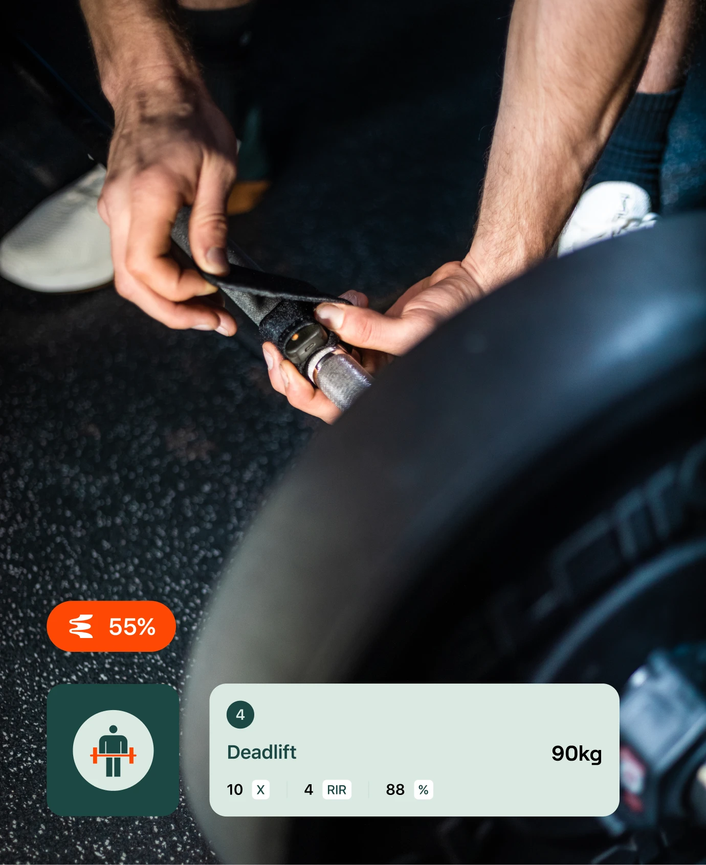
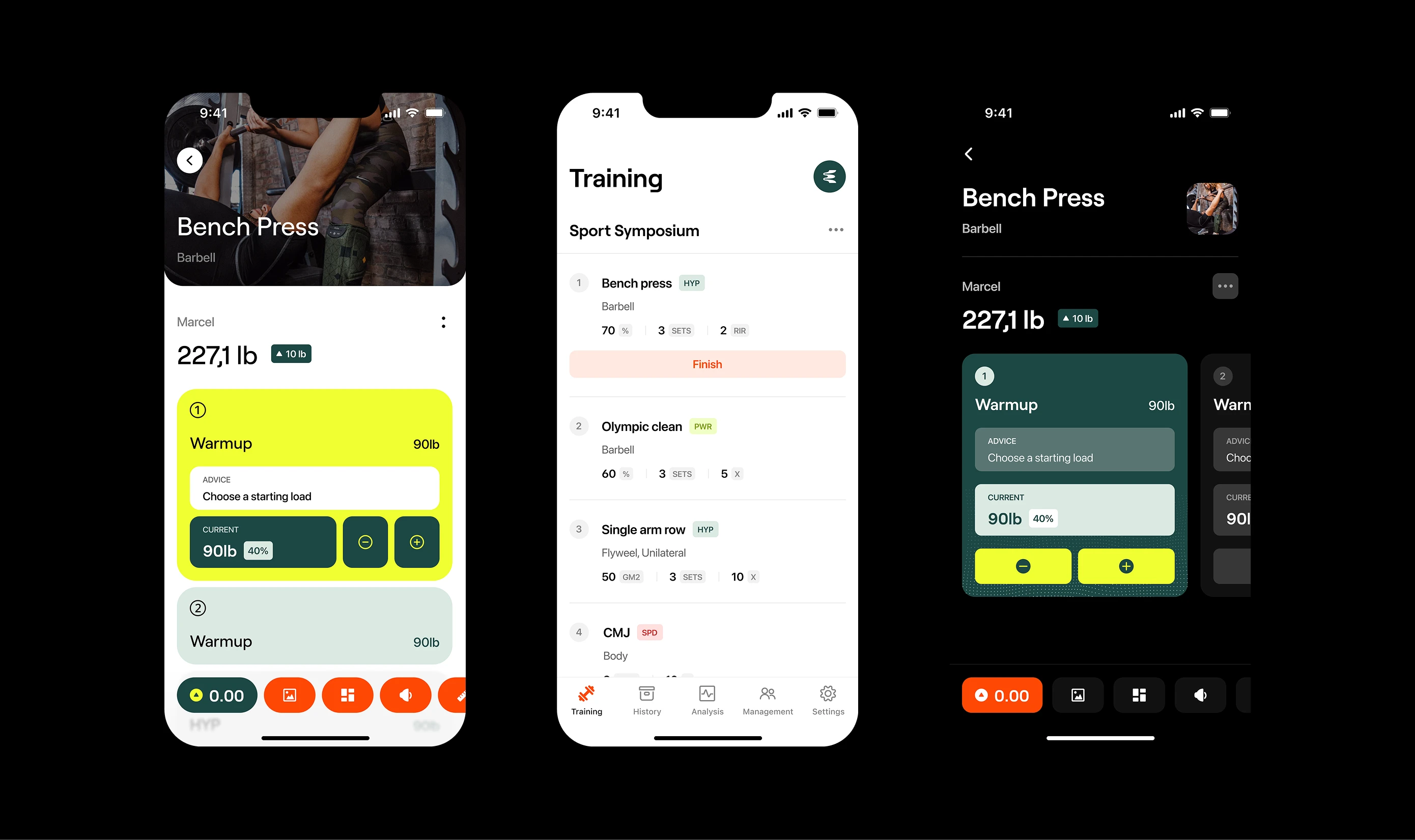
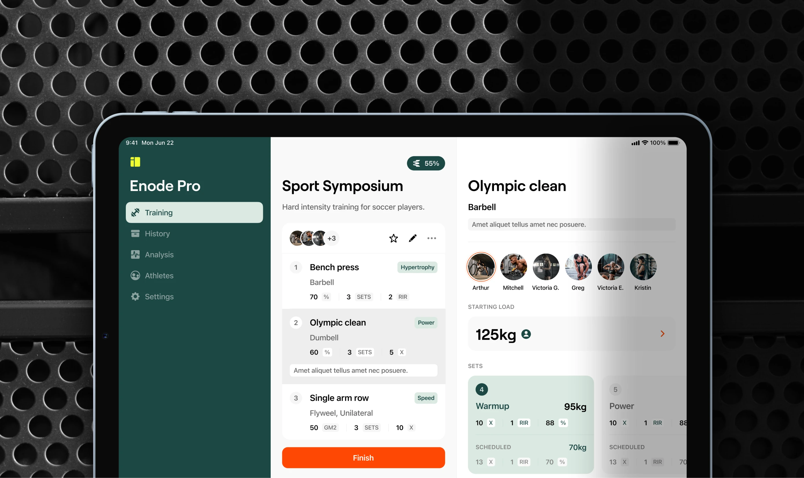
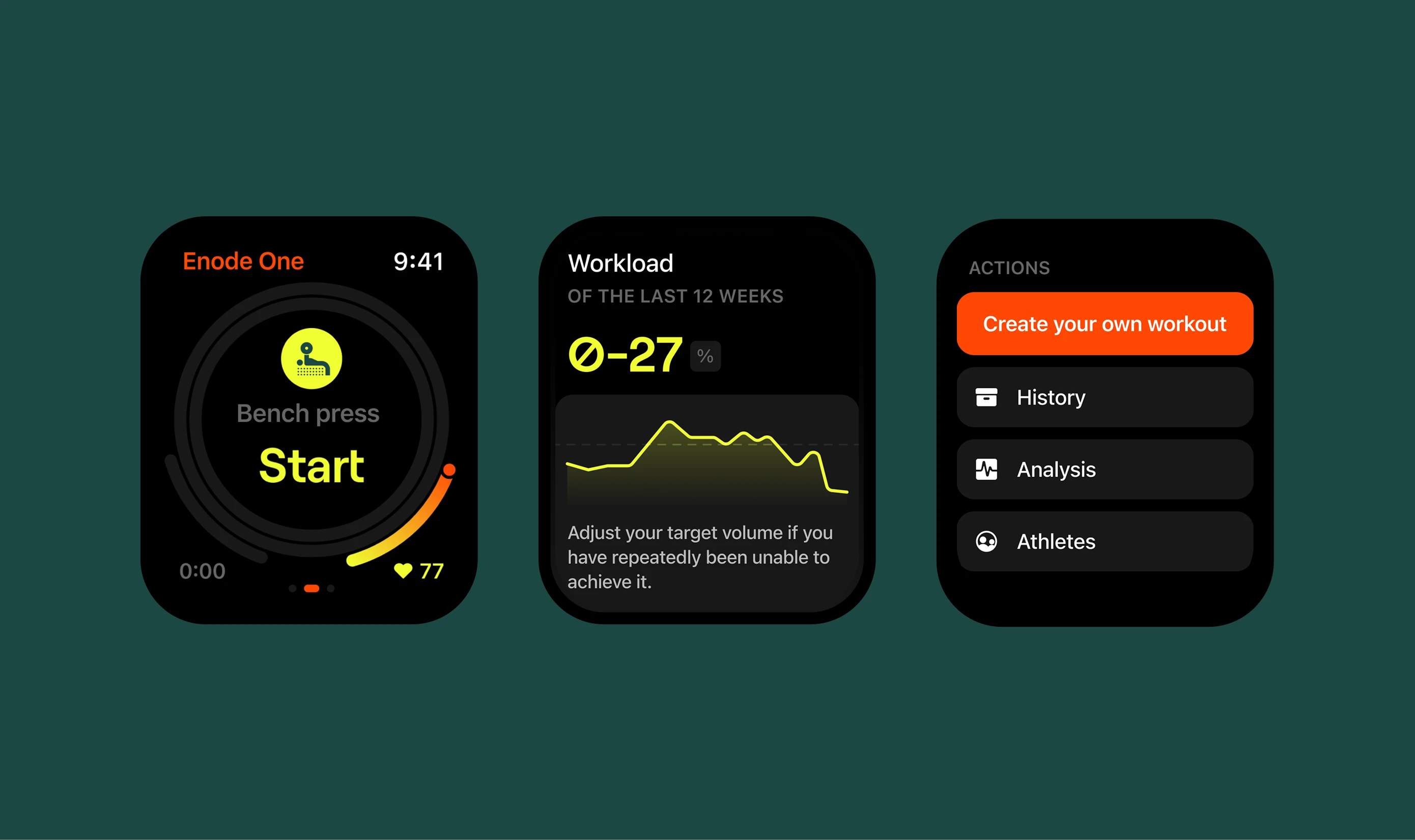
The identity needed to feel both agile and grounded. We developed a logo retaining the flexibility of movement alongside an energetic colour palette, with striking orange and acid yellow anchored by deep greens and blacks. A circular typeface was chosen for its geometric structure while still carrying rhythm and flow. An animated icon library and body map visualisations covering 40+ exercises extended the system into the product experience.
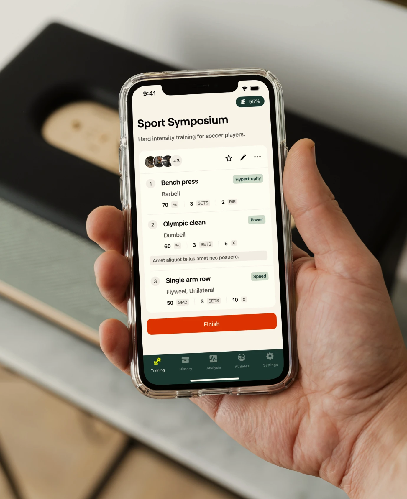
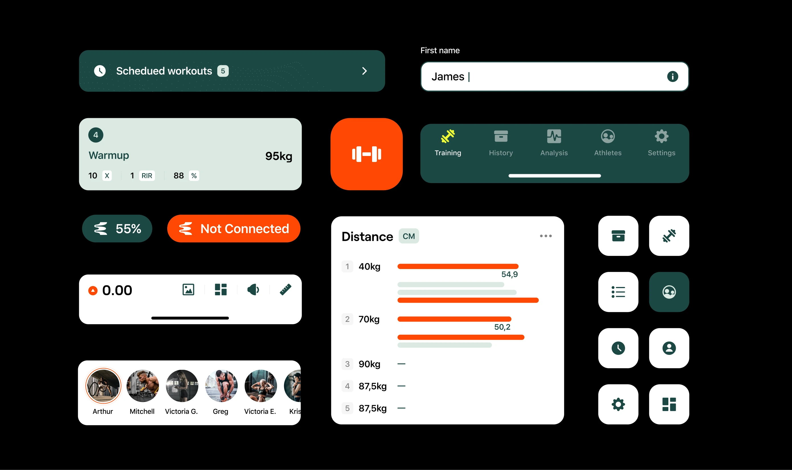
Product
The app redesign required close collaboration between branding and UI to ensure the new identity translated clearly across every screen. Information architecture and data presentation were restructured for clarity and intuition, giving users better visibility over workout routines, exercise context, and body feedback without adding cognitive load.
Our collaboration with Enode influenced the following results
2
Brands launched
Thank you
Enode: Torsten Linnecke, Marcel Blaumann.
Afternow: Vicente Reyes Montealegre, Julia Martínez, Šárka Löffelmannová, Luka Bendić, Zrinka Požar.