

Case Study
Solvd
Challenge
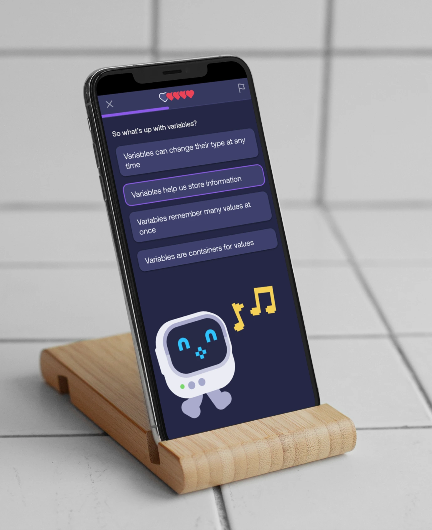
Mimo and Mimo Bootcamp had grown to serve distinct audiences — casual learners and career-switching professionals — but their visual identities were too similar to communicate that difference. The M1M0 avatar was loved by the community but lacked the depth needed to carry the brand’s emotional weight.
Strategy
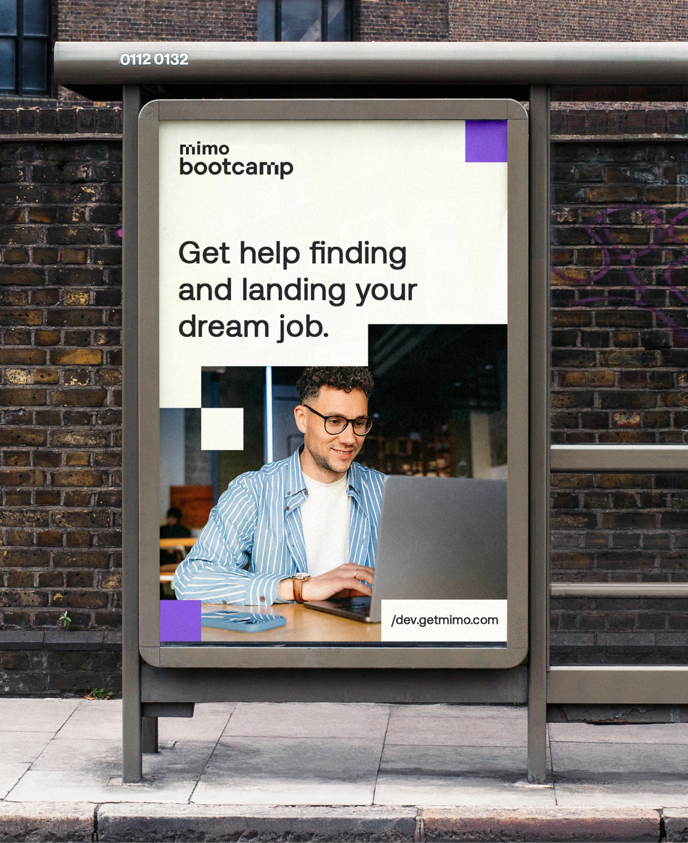
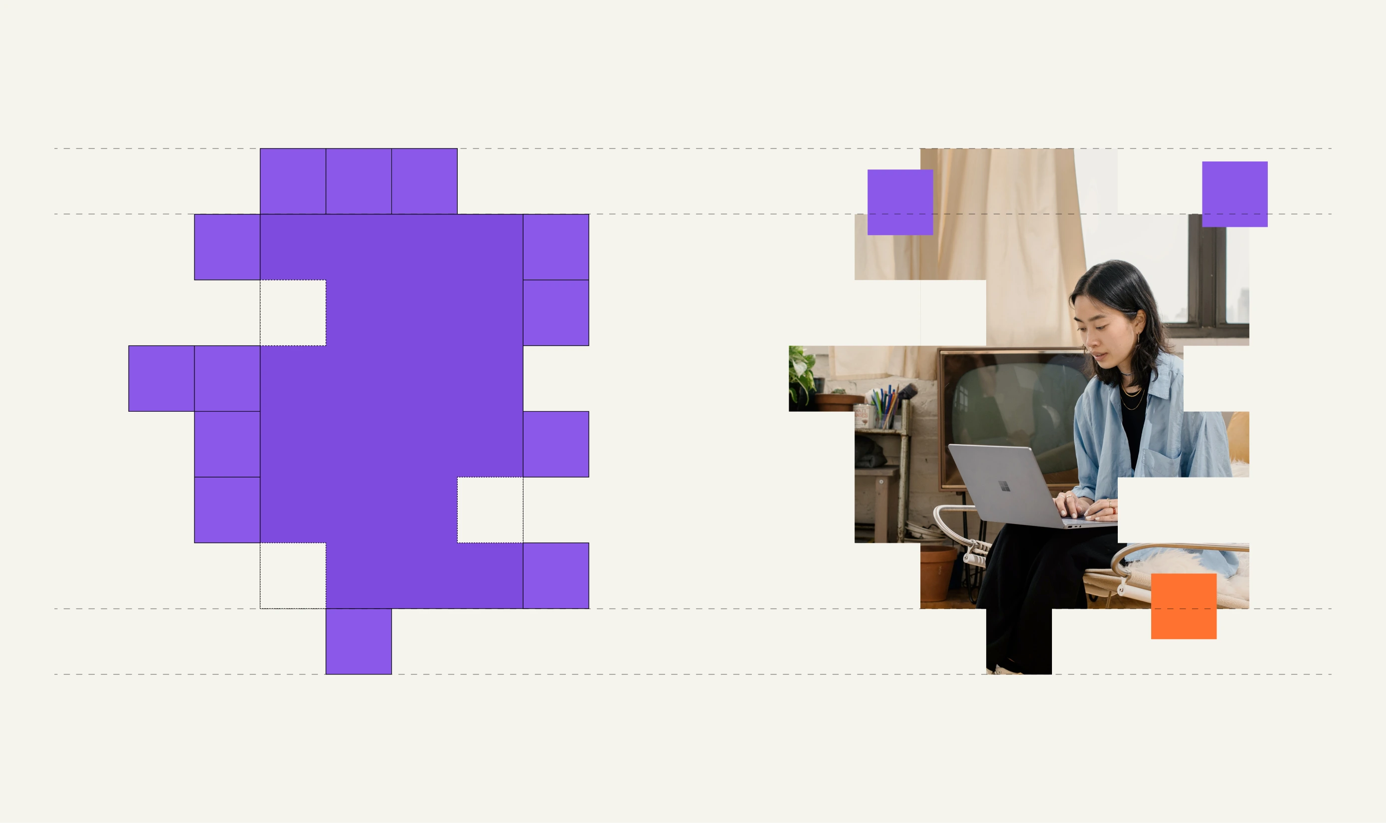
Discovery surfaced a core tension: a single visual system was being stretched across two products with fundamentally different value propositions. We made the strategic decision to introduce a clear split, keeping Mimo playful and accessible while developing a more sophisticated identity for Mimo Bootcamp, without breaking the shared brand family.
Brand
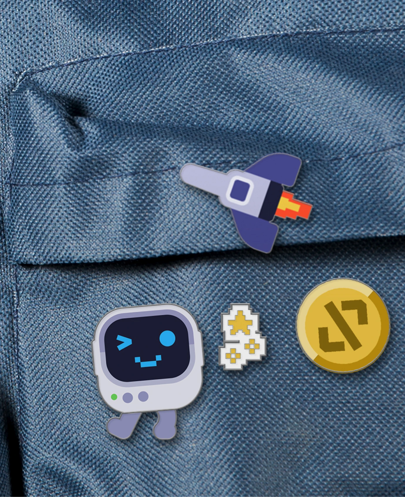
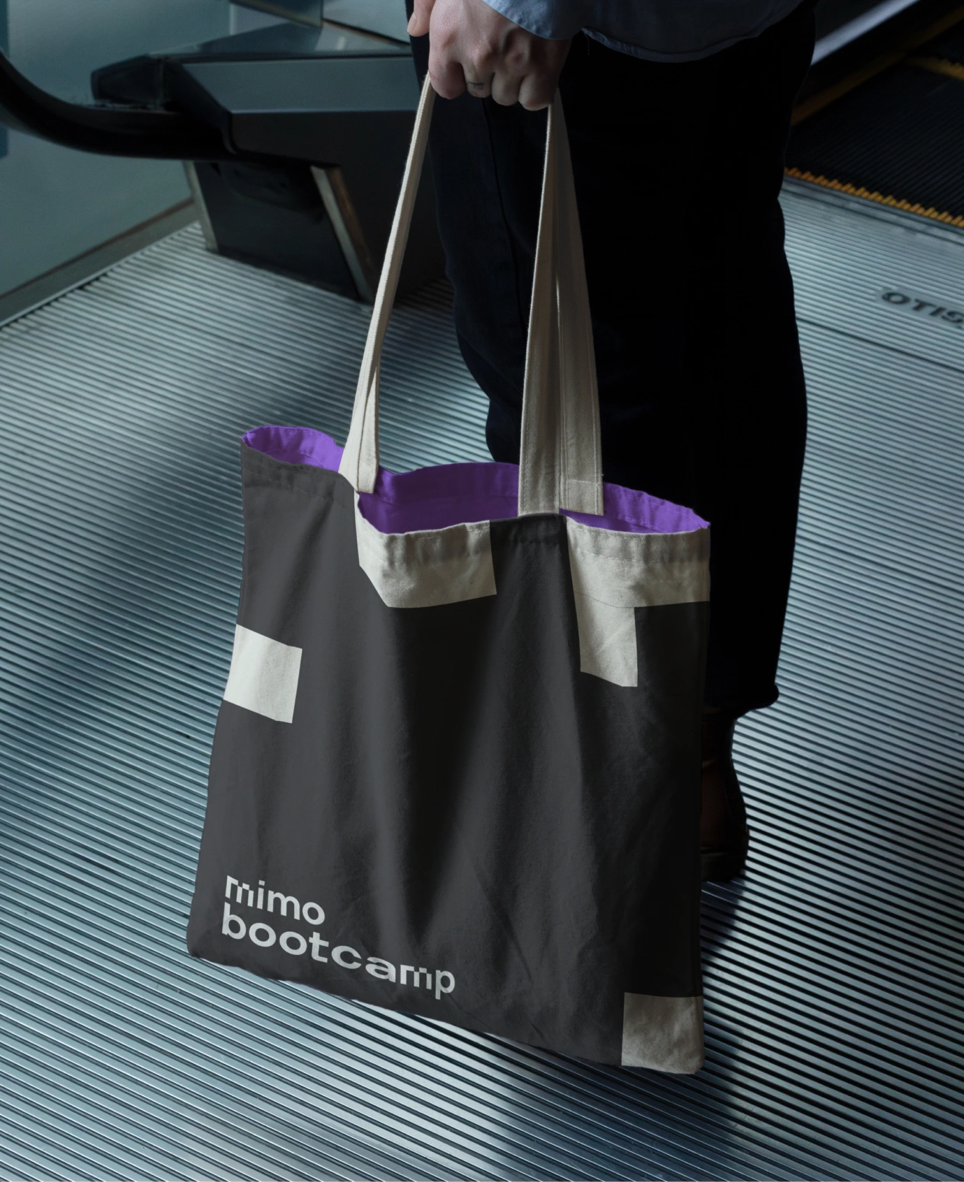
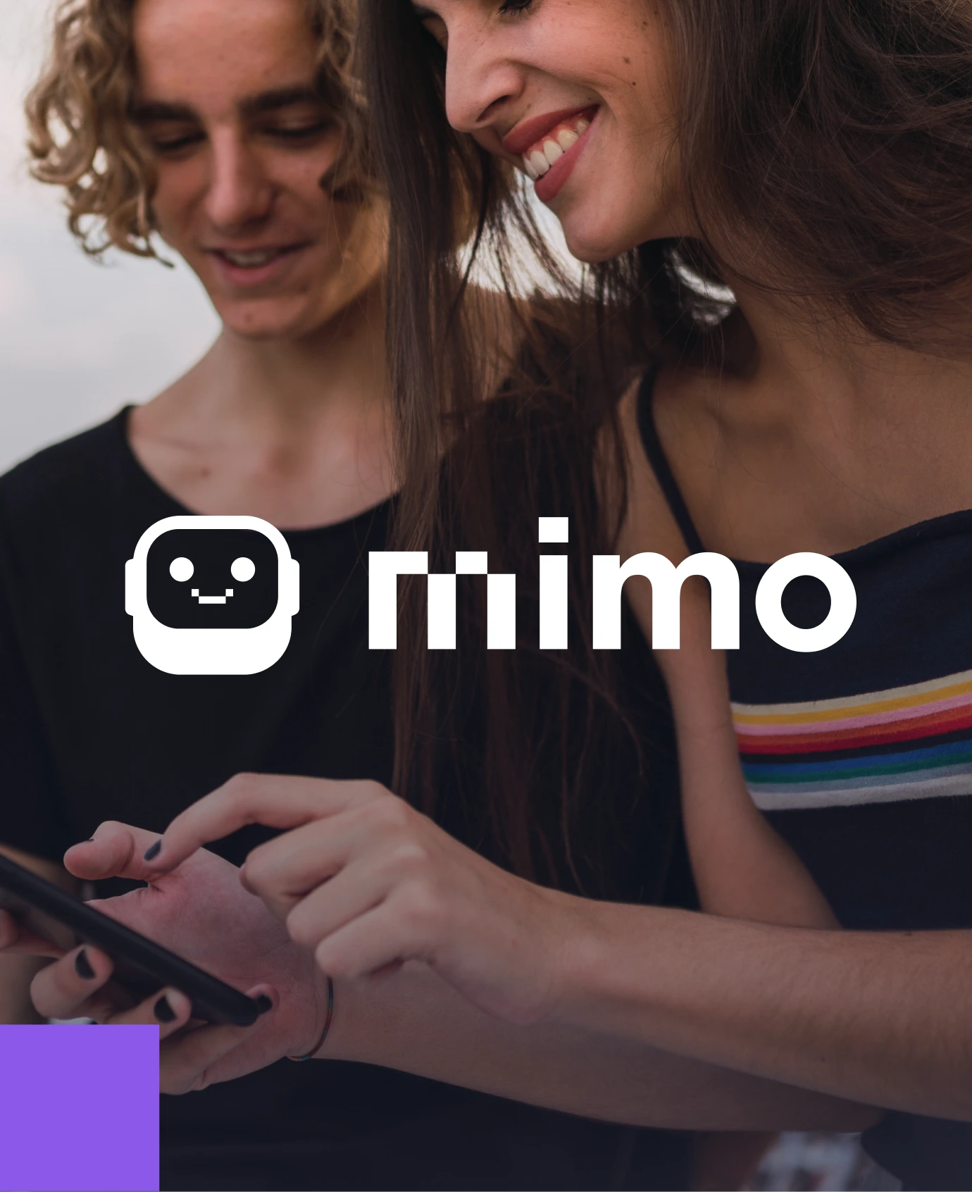
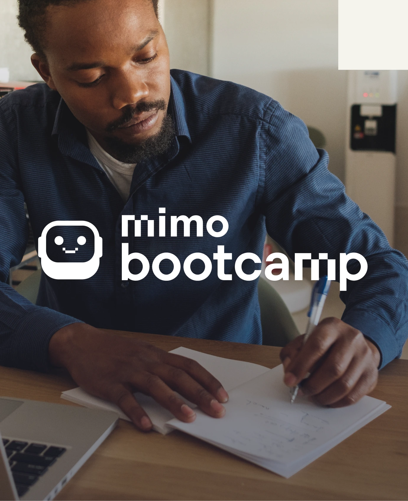
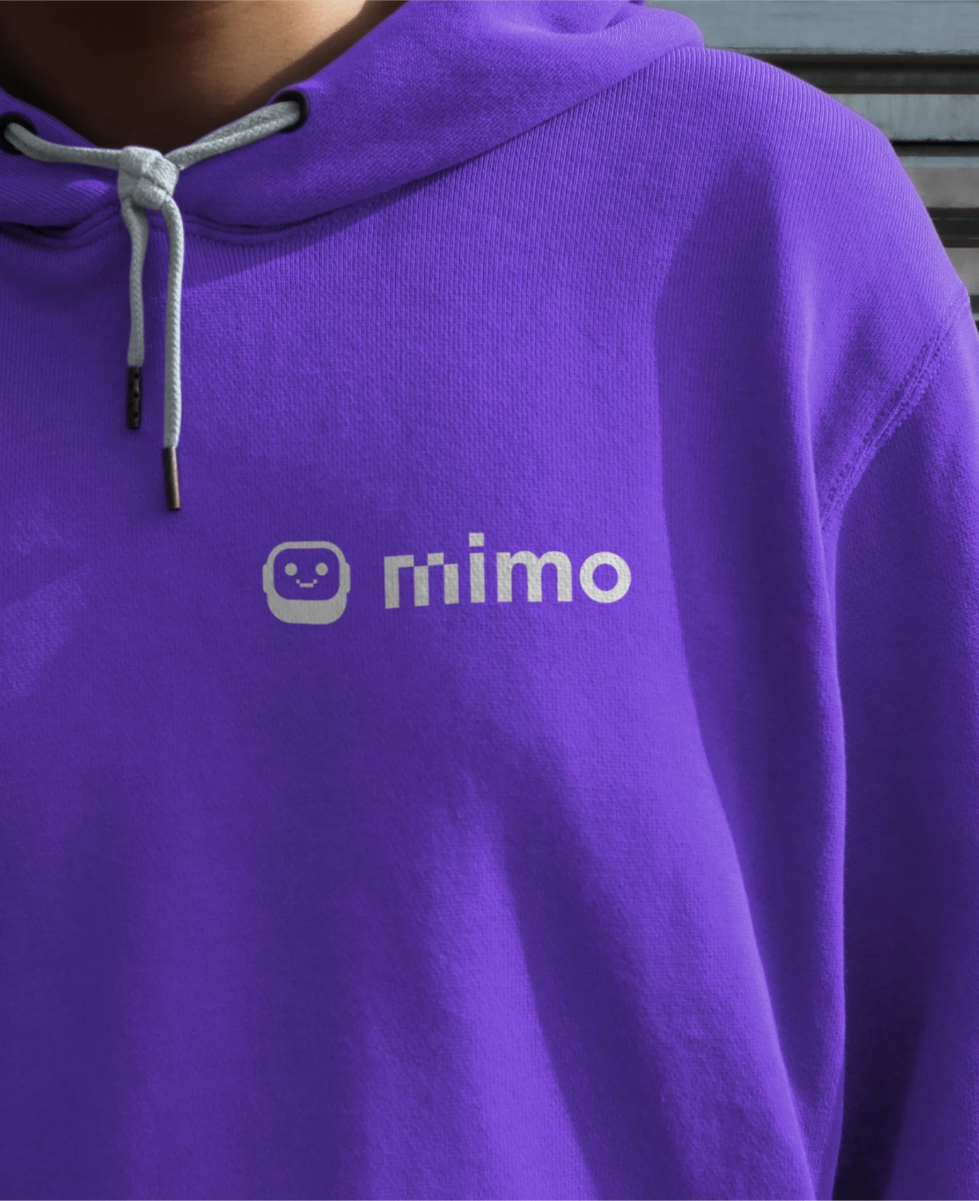
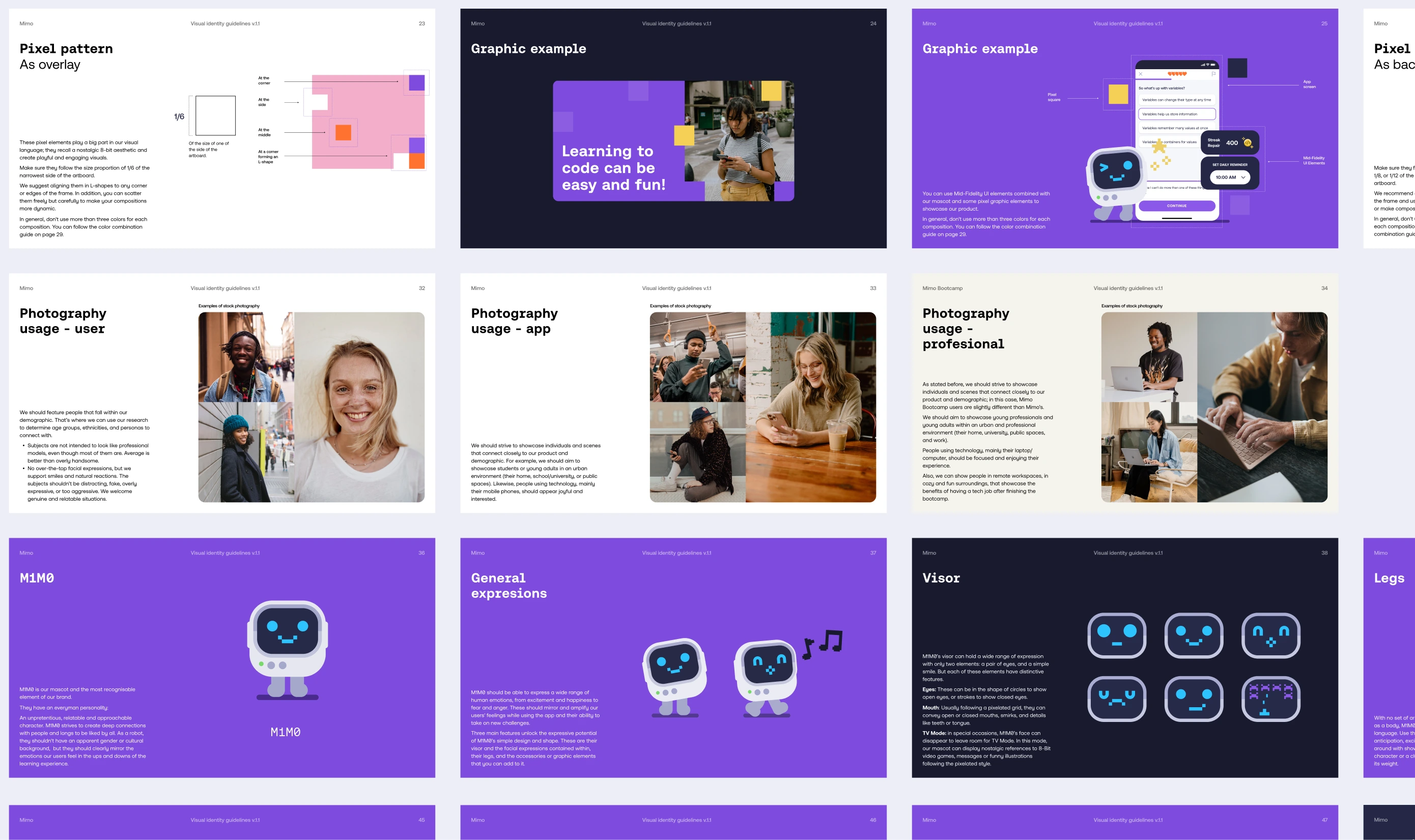
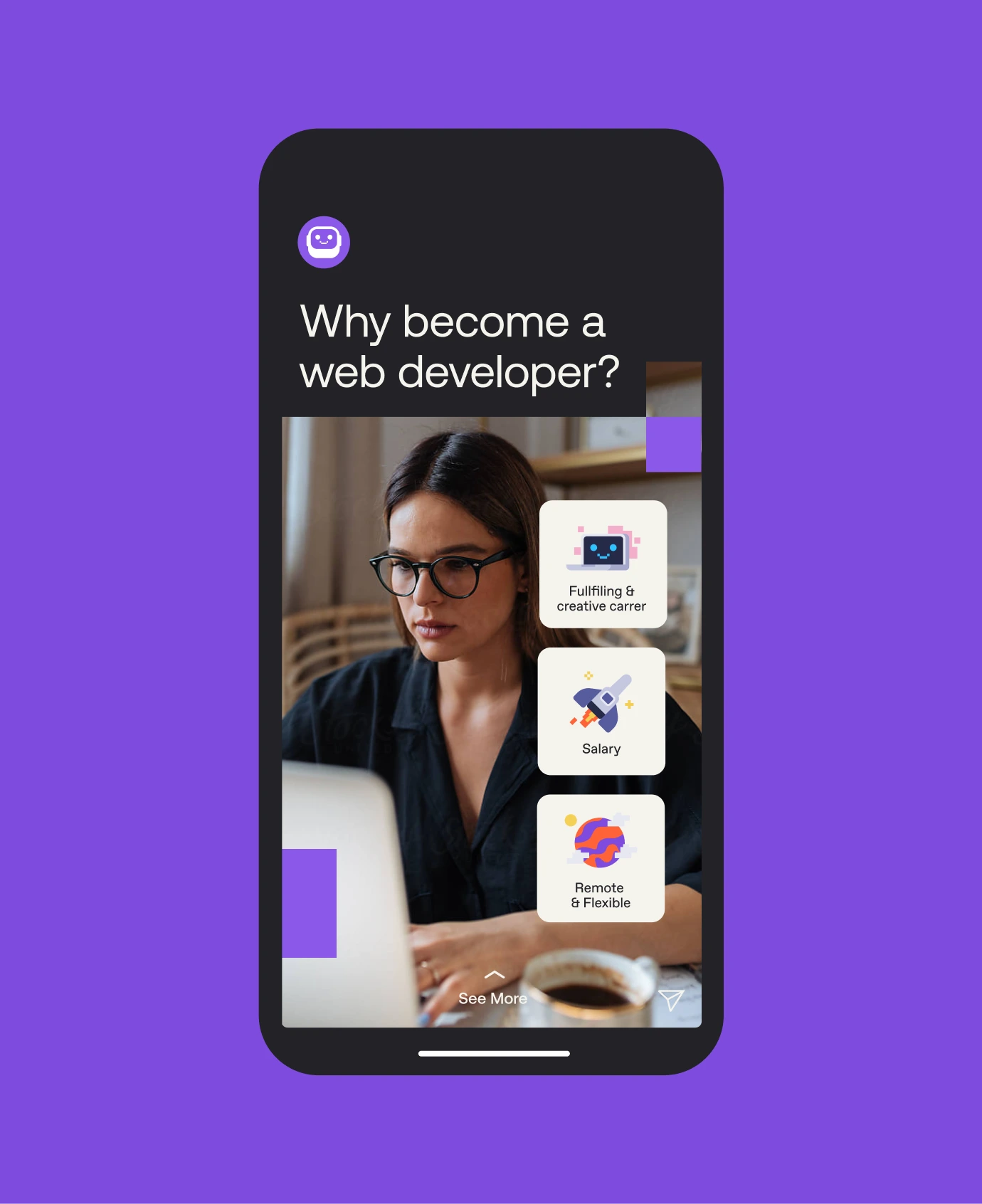
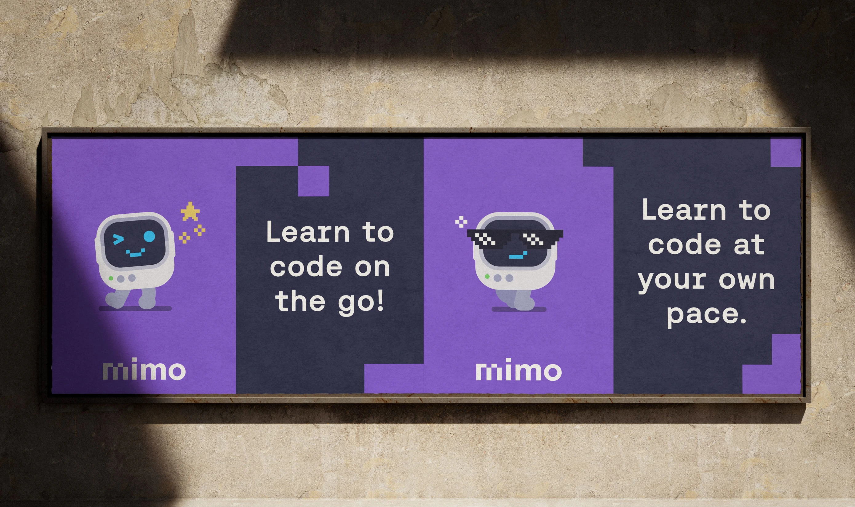
Mimo retained its bold, vibrant palette while we evolved the wordmark with a mixed typographic approach: square pixel geometry on the first two letters, geometric sans on the last two — nodding to an 8-bit aesthetic that resonates across generations. Mimo Bootcamp received a parallel identity, more restrained and more professional, clearly positioned for a higher-investment audience. M1M0 was redesigned with a broader emotional range, using facial expressions, body language, and expandable accessories to become a genuine companion throughout the learning journey.

Our collaboration with Mimo influenced the following results
35M+
Learners world wide
750k
5 stars reviews
Thank you
Mimo: Lorenz Schimik, Filip Gres, Katya Gamsriegler.
Afternow: Marta Izquierdo, Vicente Reyes Montealegre, Eliana Martínez, Katarina Jozic.
Related case studies
See all case studies
Strategy
Brand
Website
Development
Strategy
Brand
Website
Development
Holocene
From startup to enterprise partner
Clarity as a competitive advantage in a technical industry
Strategy
Brand
Website
Development