

Case Study
Solvd
Challenge
ThoughtSpot’s design team had built strong foundations, but wanted to explore how far the product experience could be pushed without breaking what already worked. The brief was open-ended: find the edge of possibilities within the existing design system, question current decisions, and surface directions the internal team hadn’t considered.
Research
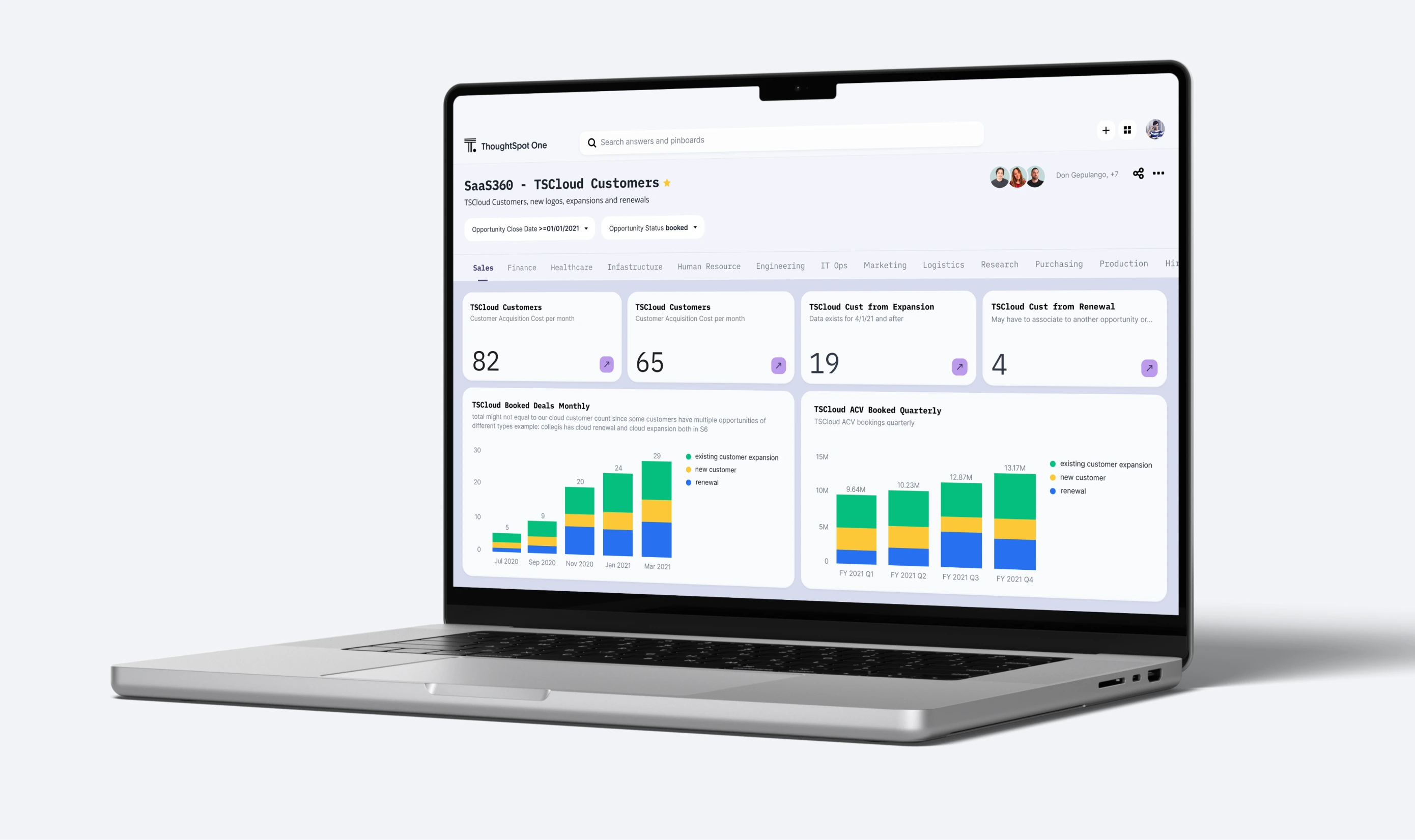
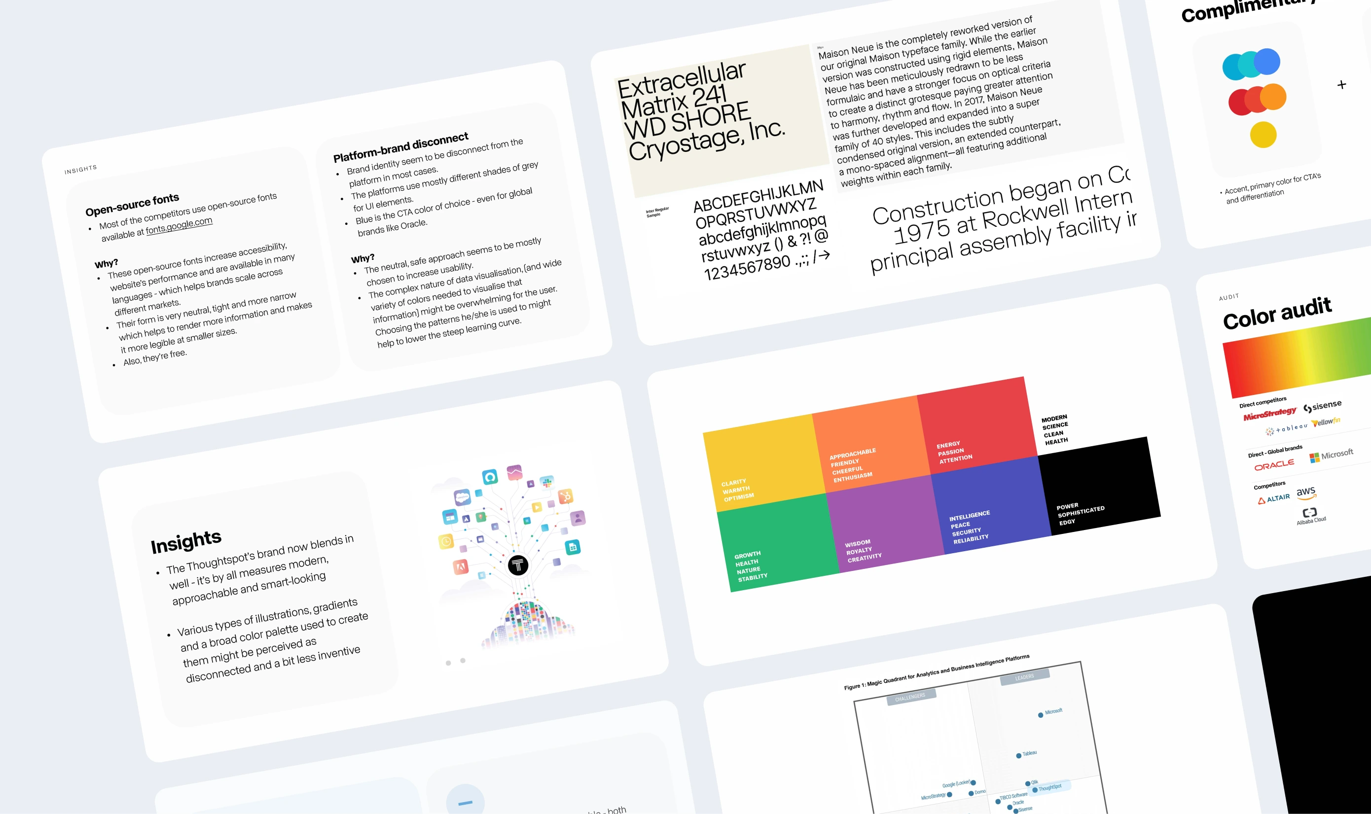
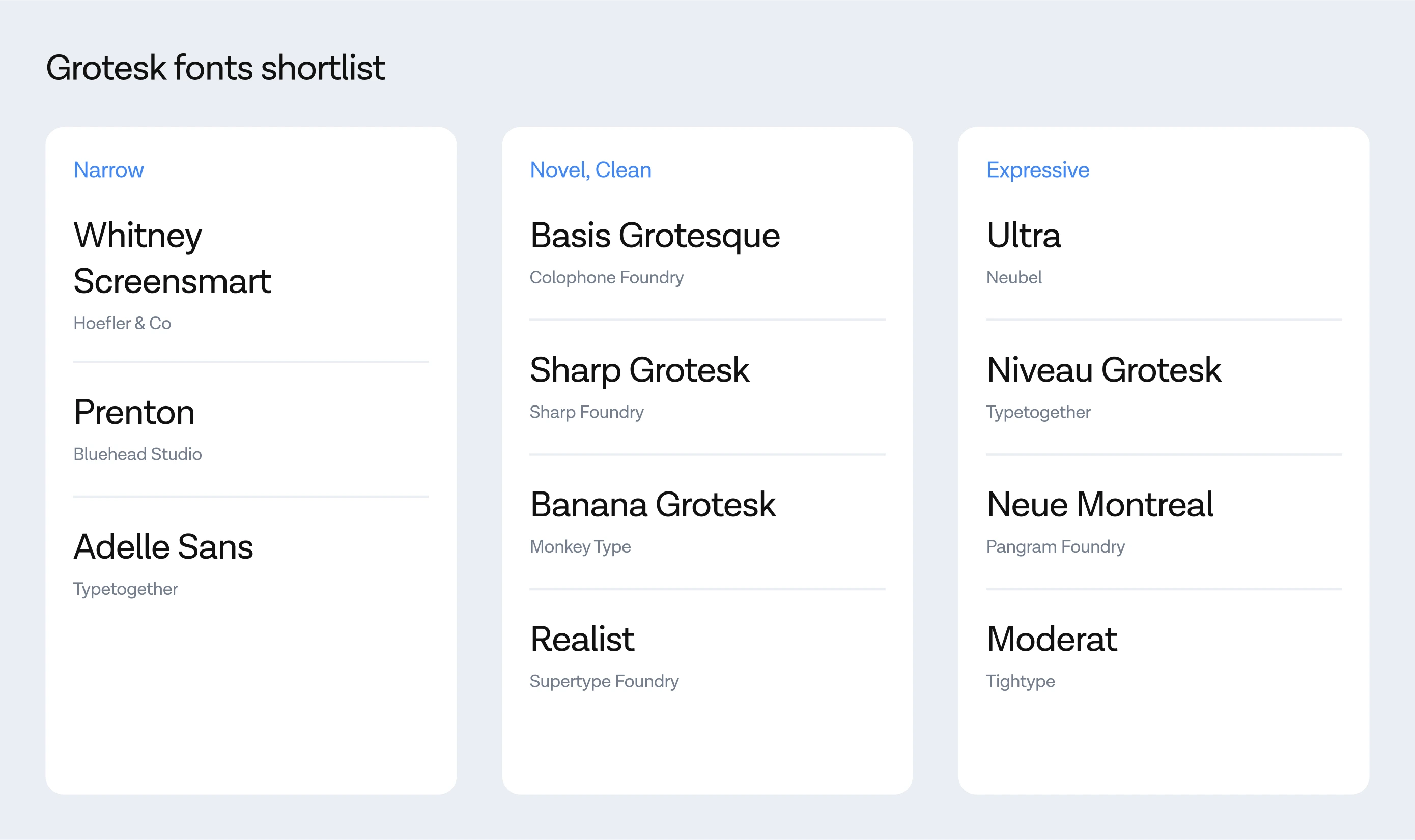
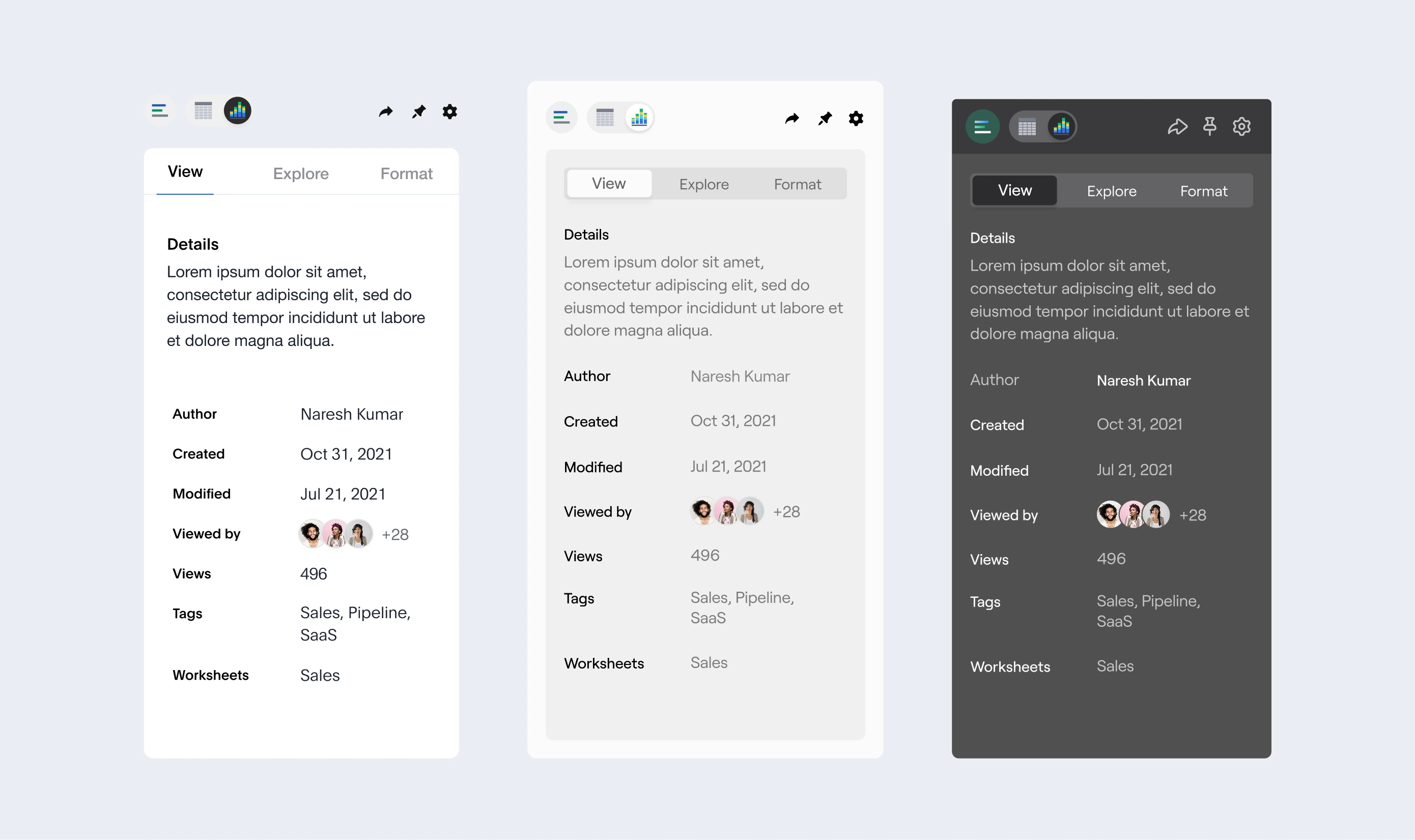
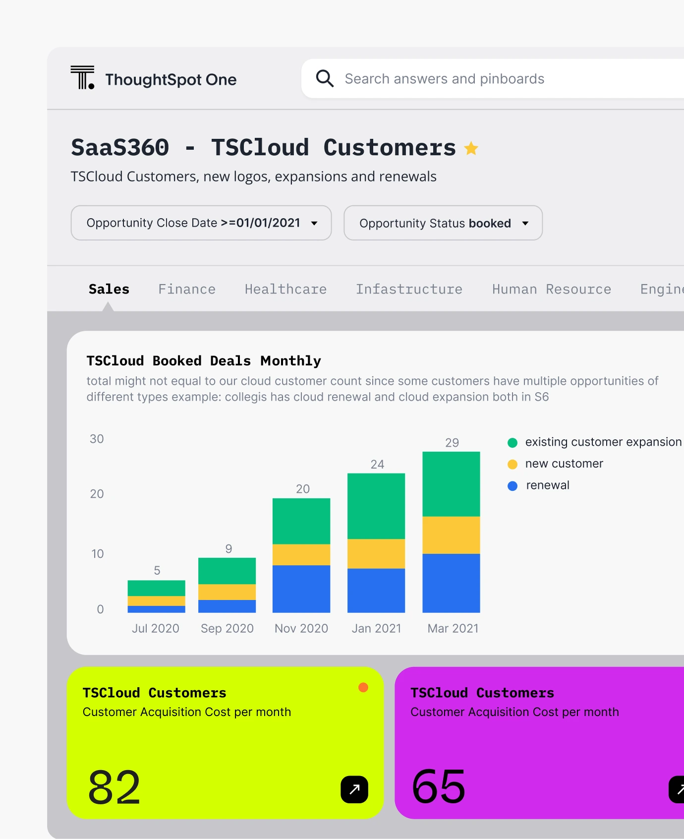
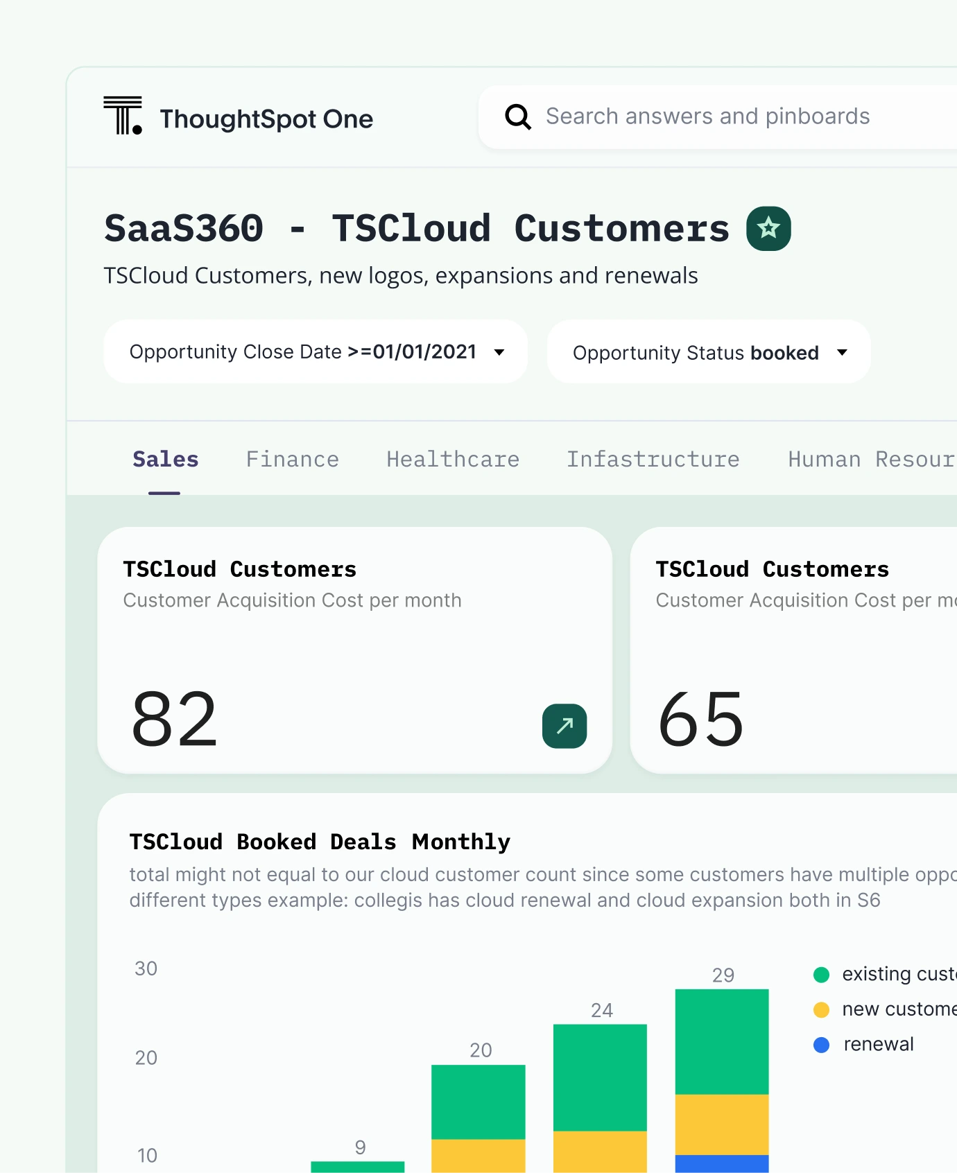
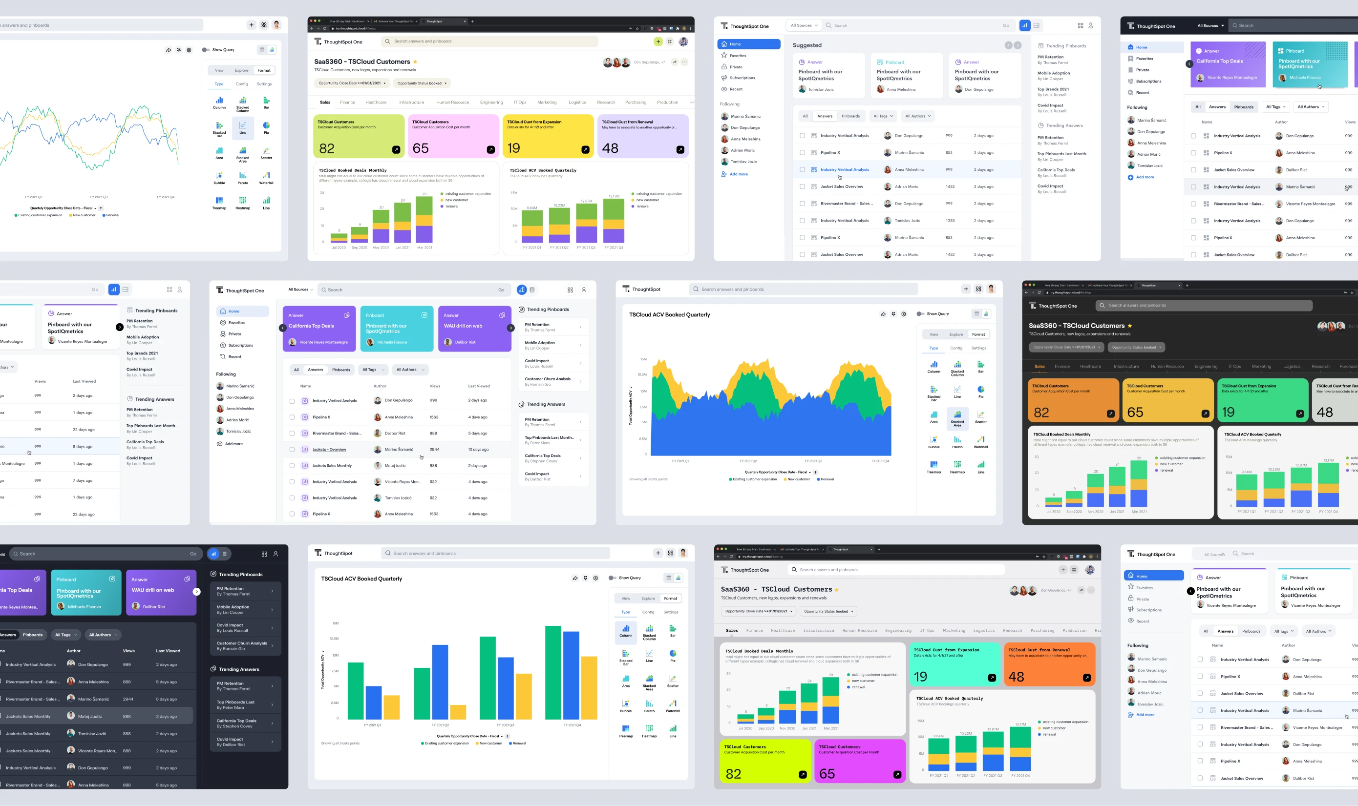
A competitive benchmark mapped where ThoughtSpot sat relative to peers, followed by exploration of user personas and navigation flows to identify where the experience could feel more intuitive and expressive. Wireframes helped test structural ideas before committing to visual direction.
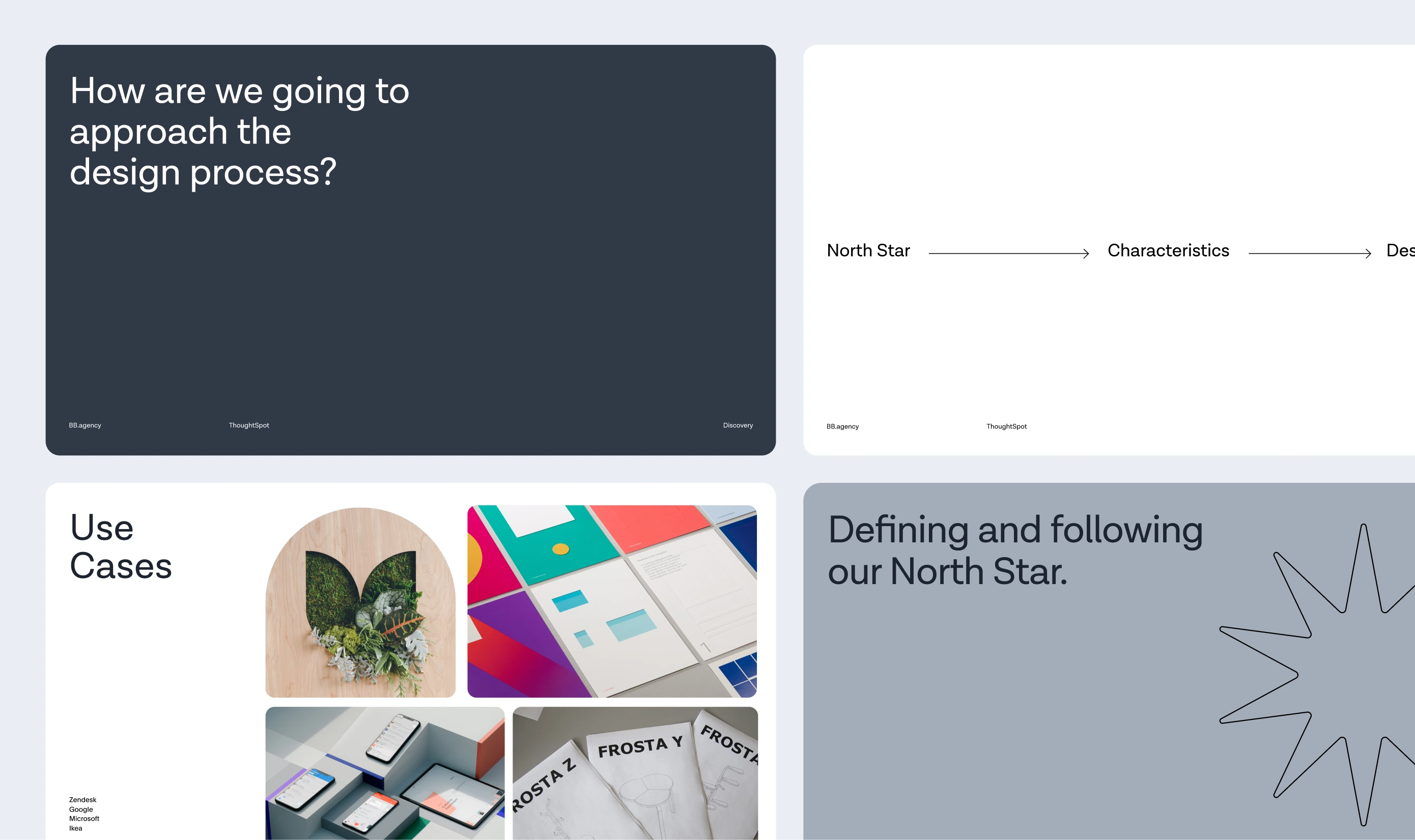
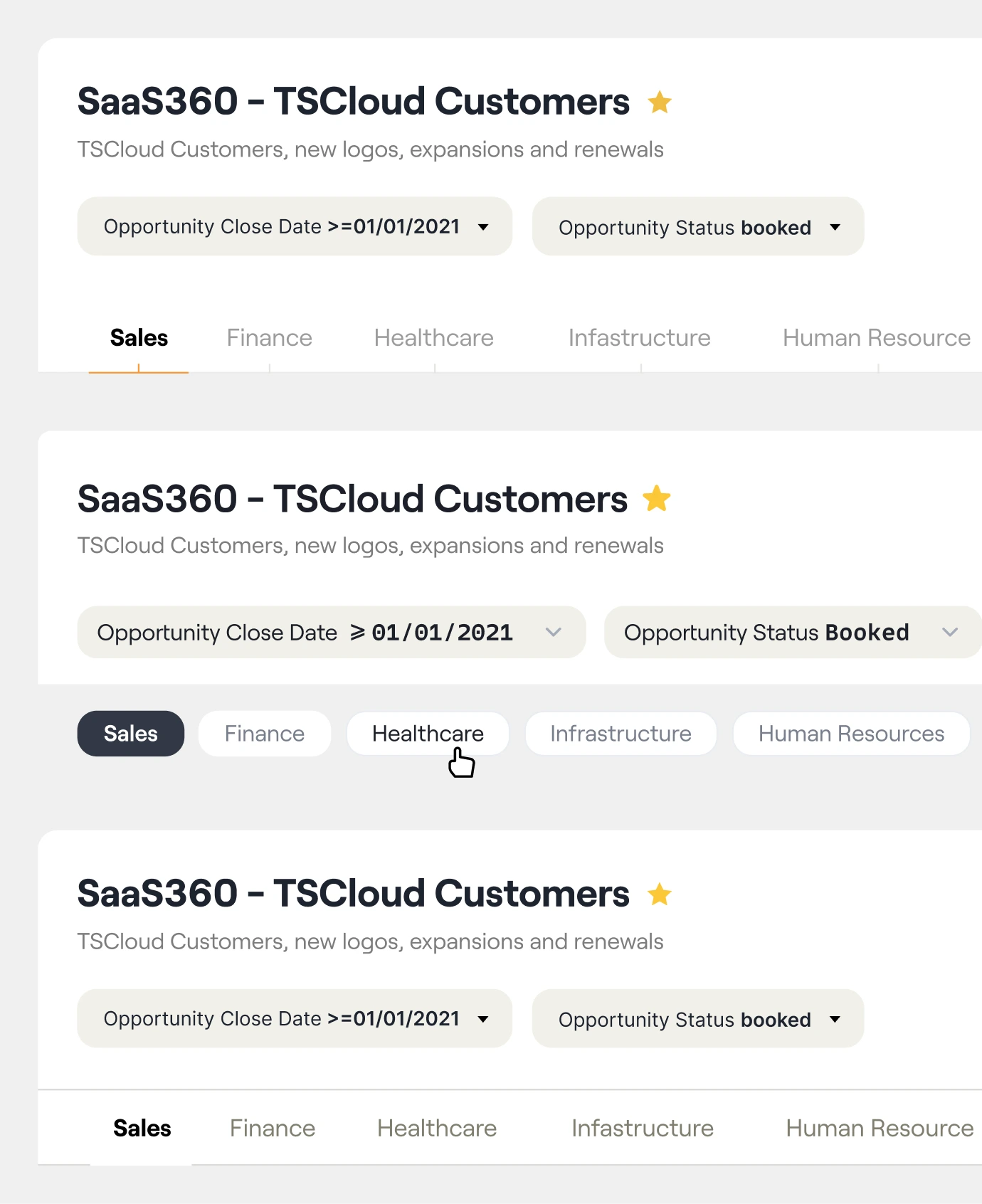
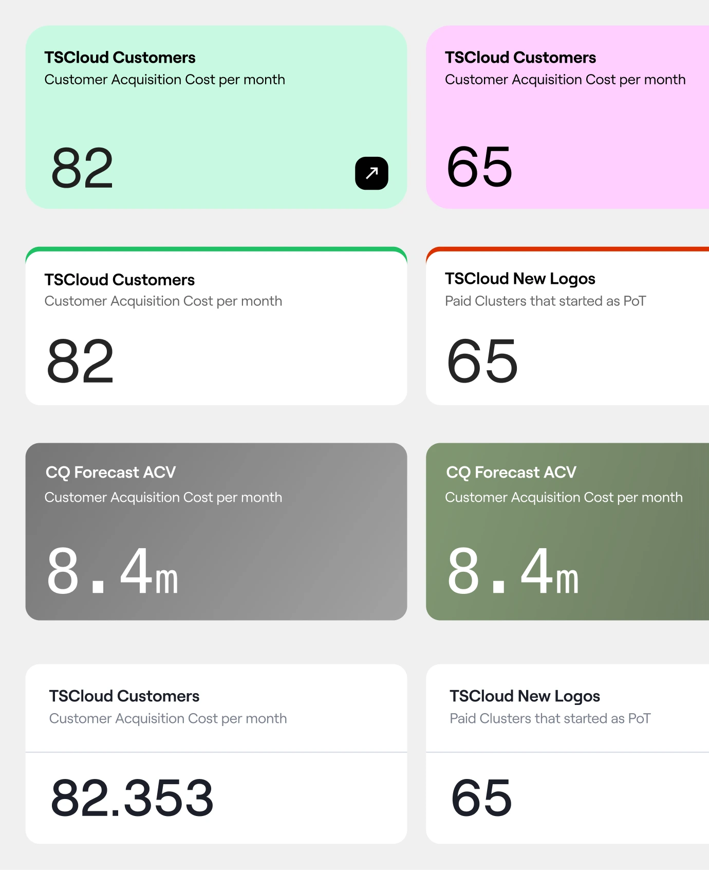
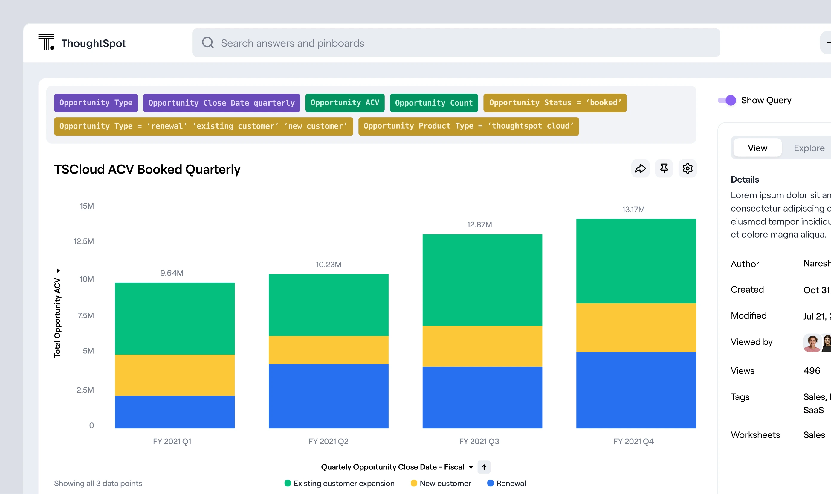
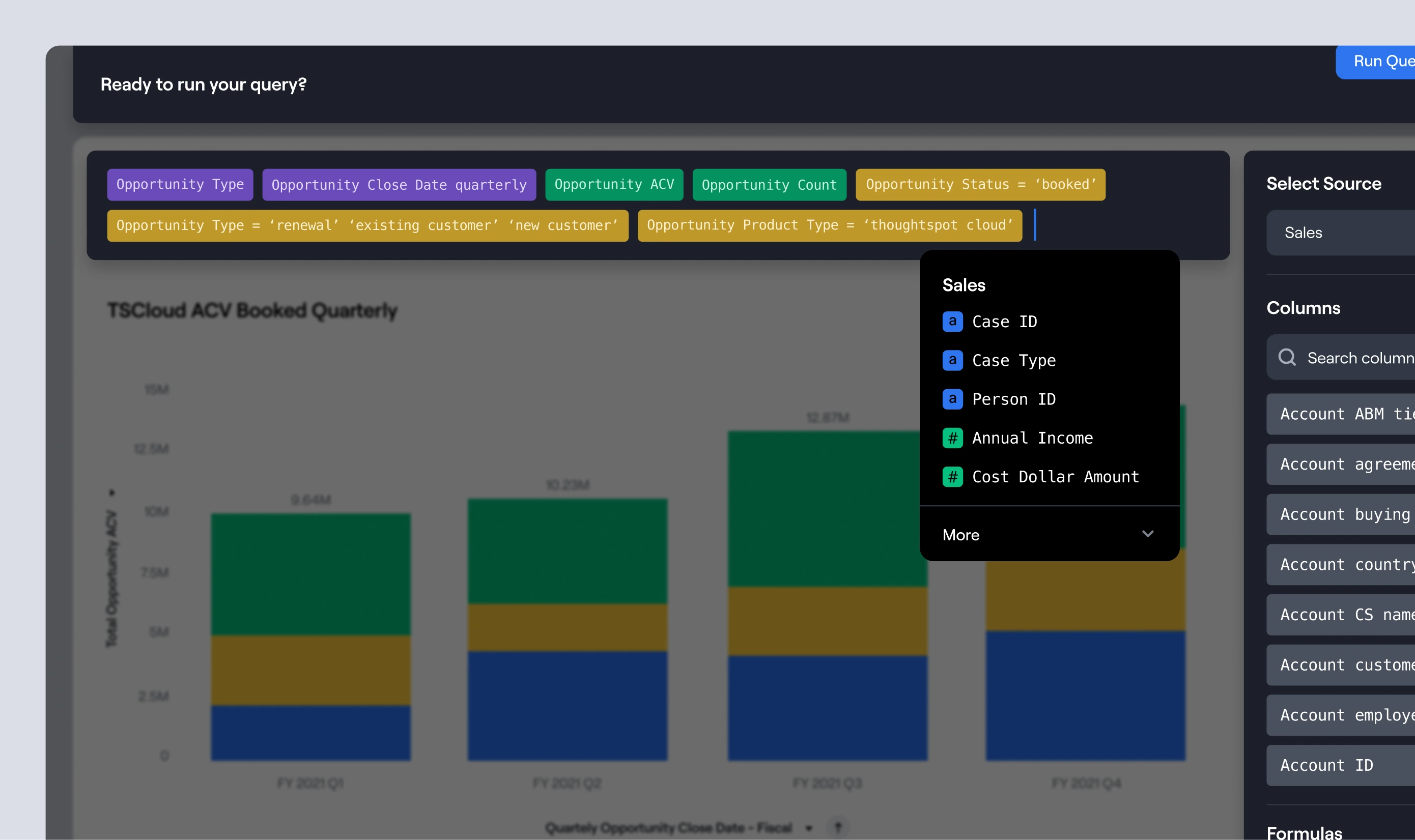
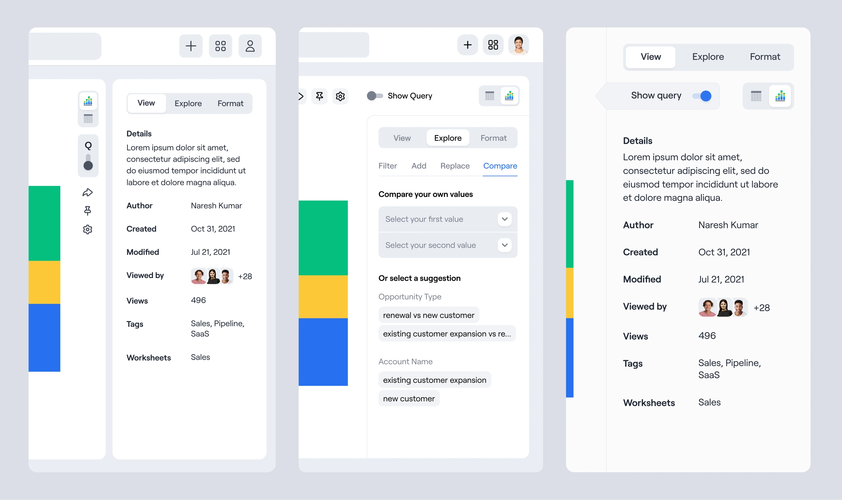
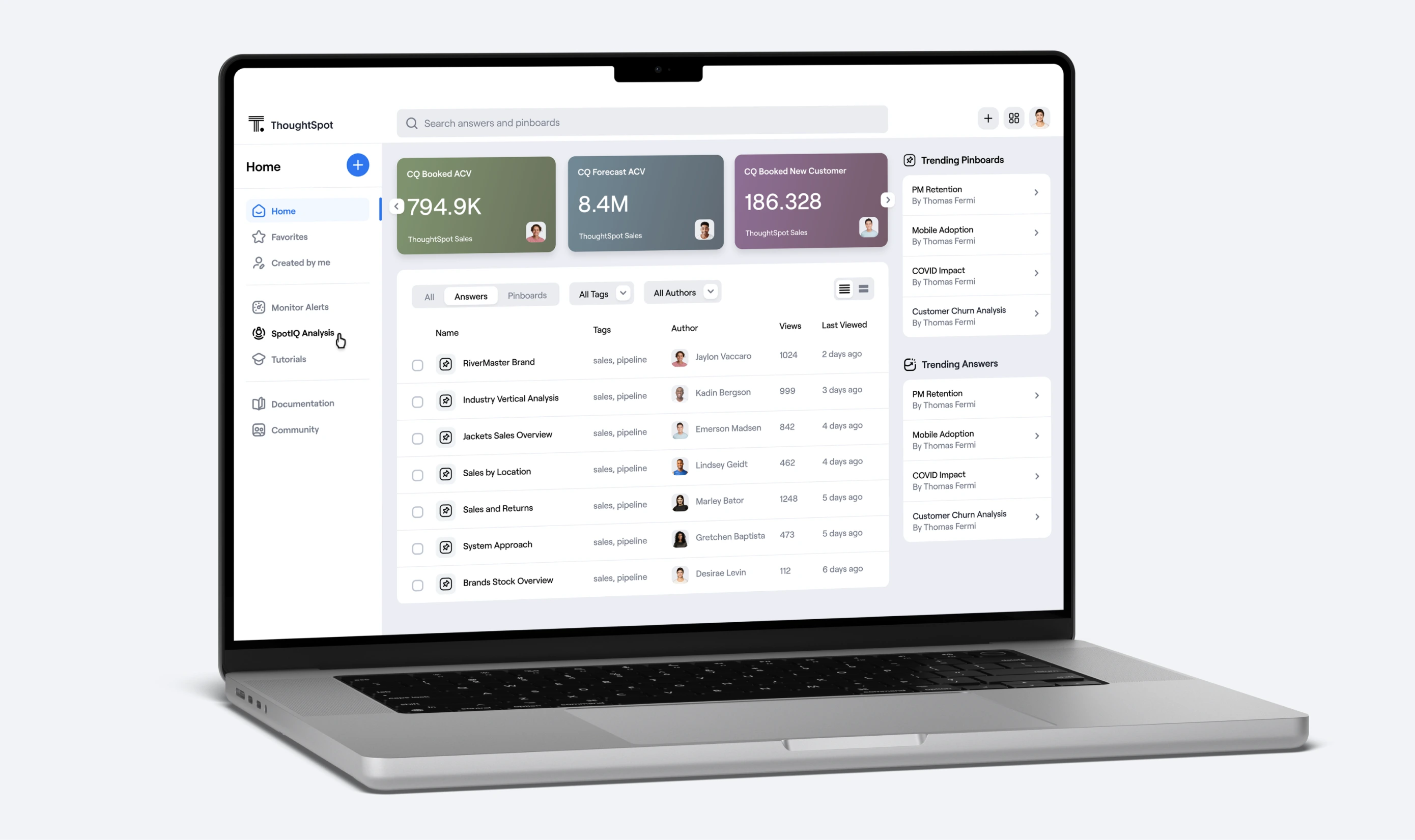
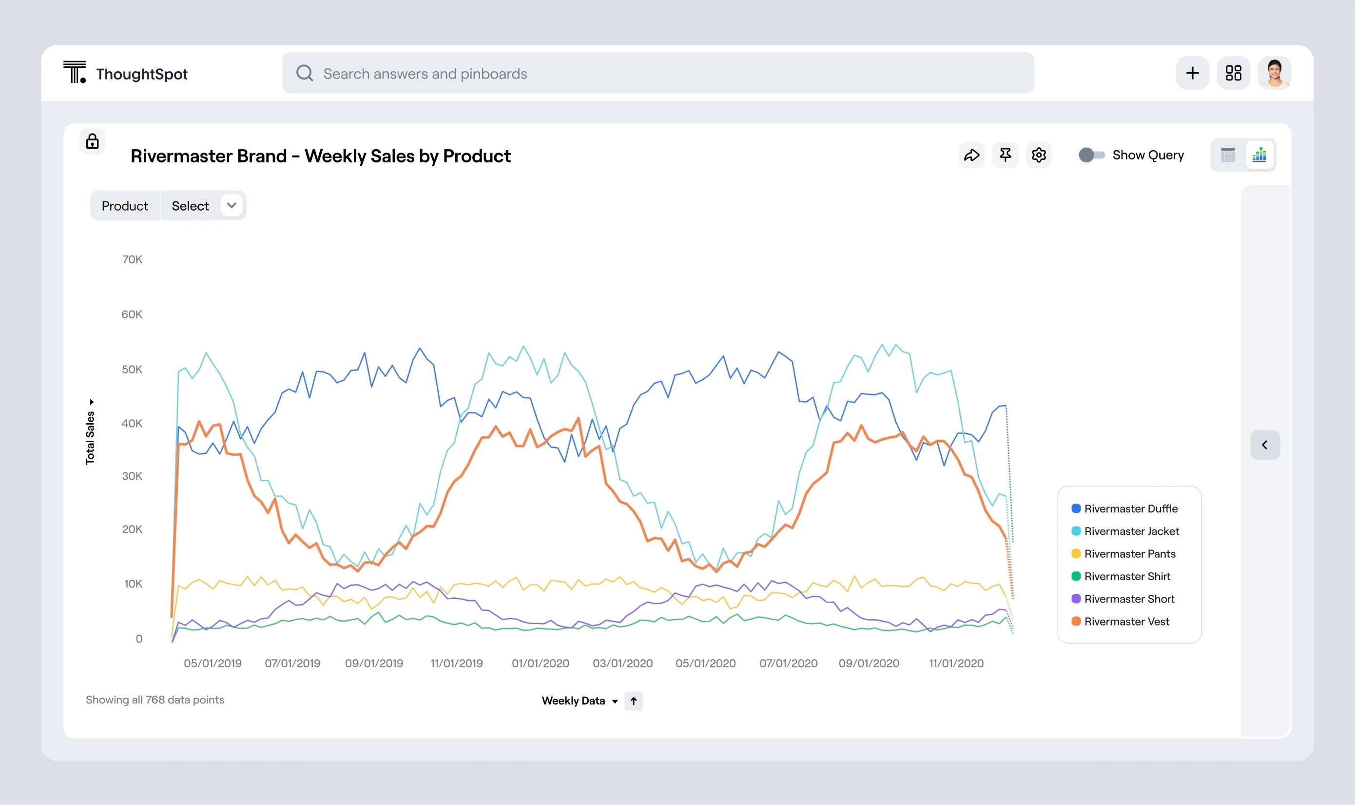
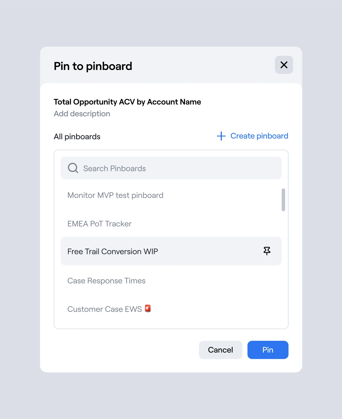
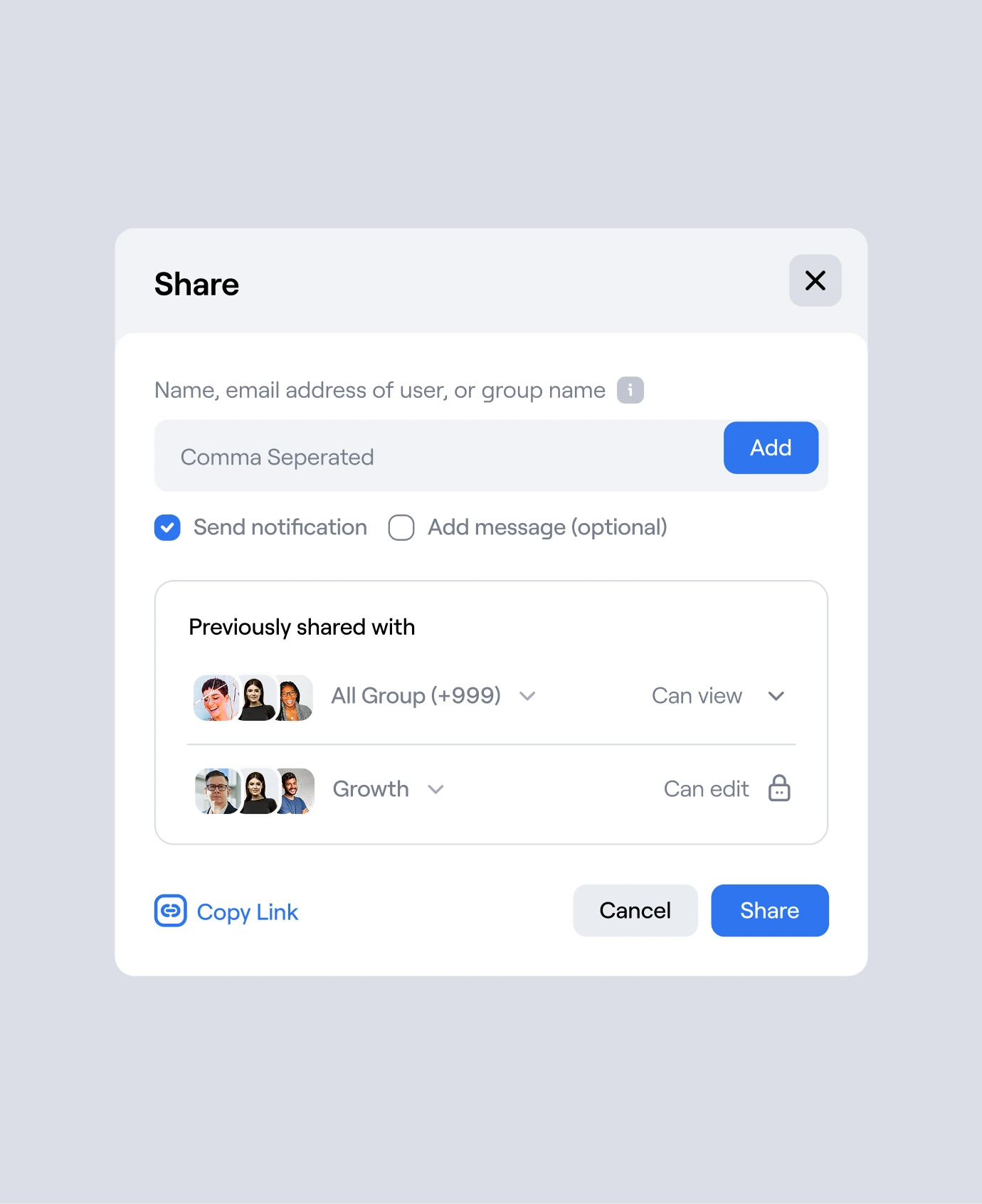
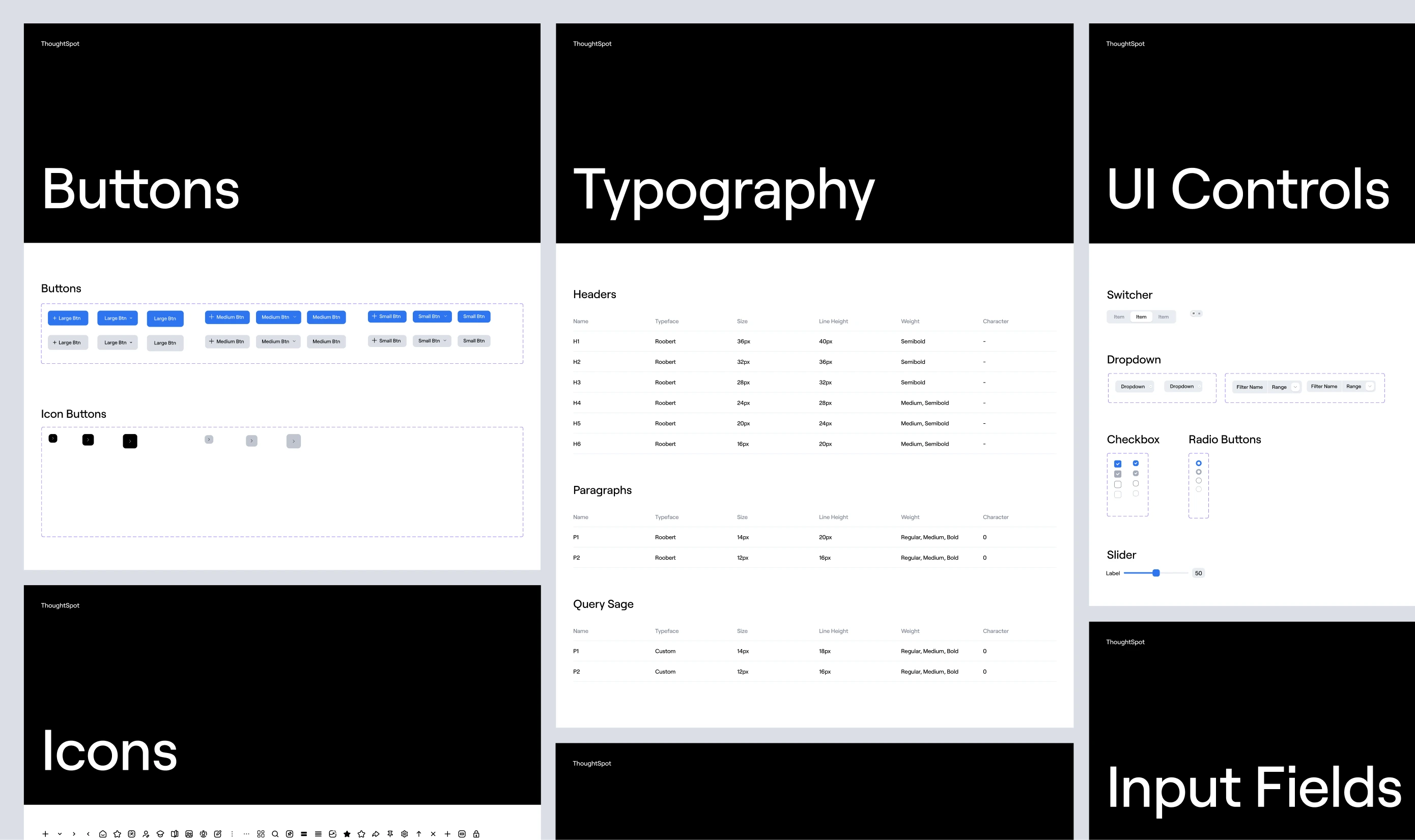
Product
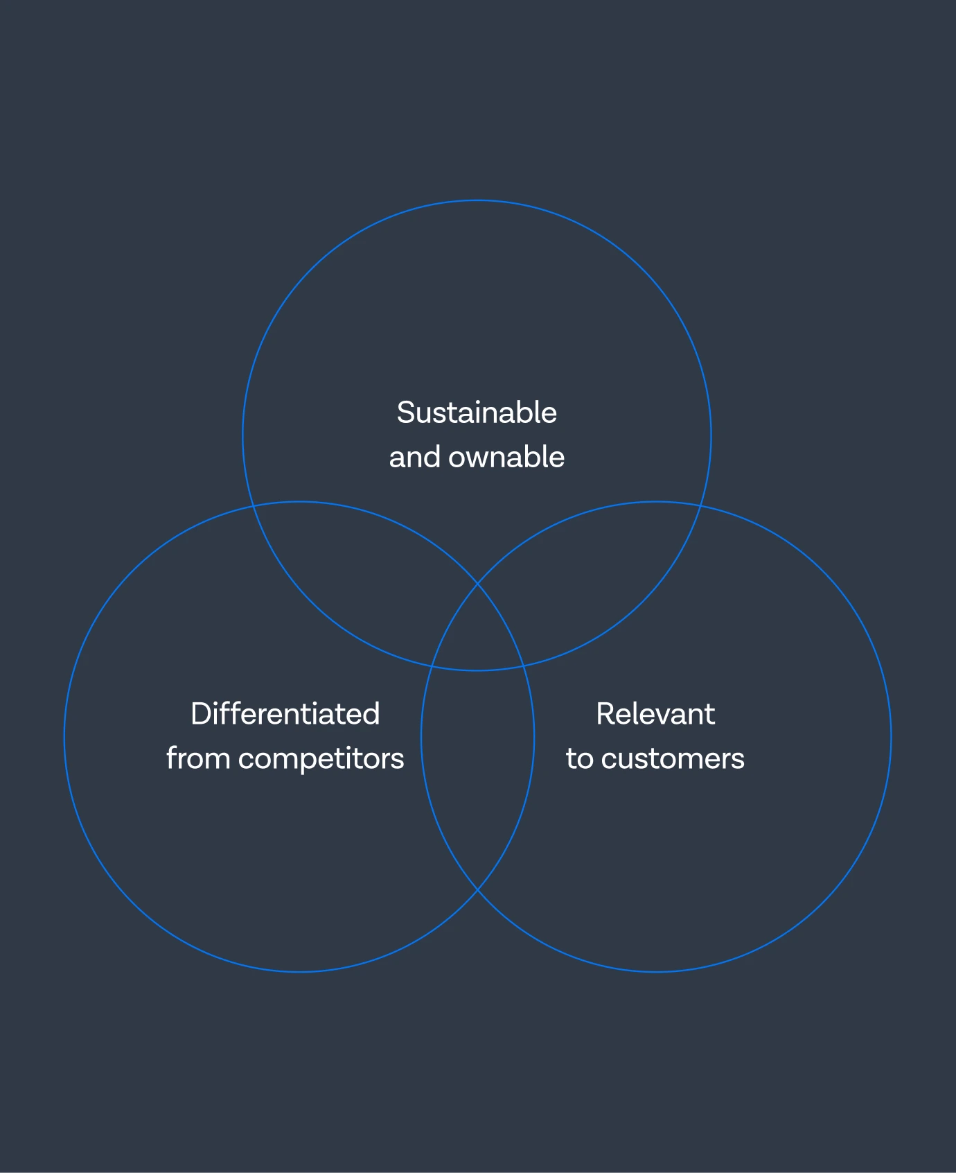
The collaboration centred on discovering new approaches to visual appearance and structural order — working within the existing design system rather than replacing it. Unusual directions were explored to accentuate the tool’s accessible, everyone-first goal through more playful and expressive uses of form, colour, and typography.

Our collaboration with ThoughtSpot influenced the following results
2
Projects worked on together
$663.7m
Raised across 11 funding rounds